Infographics

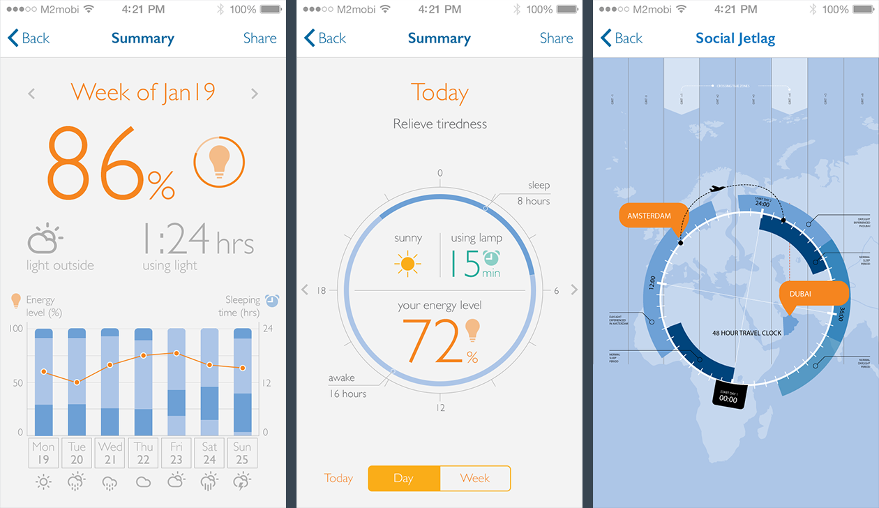
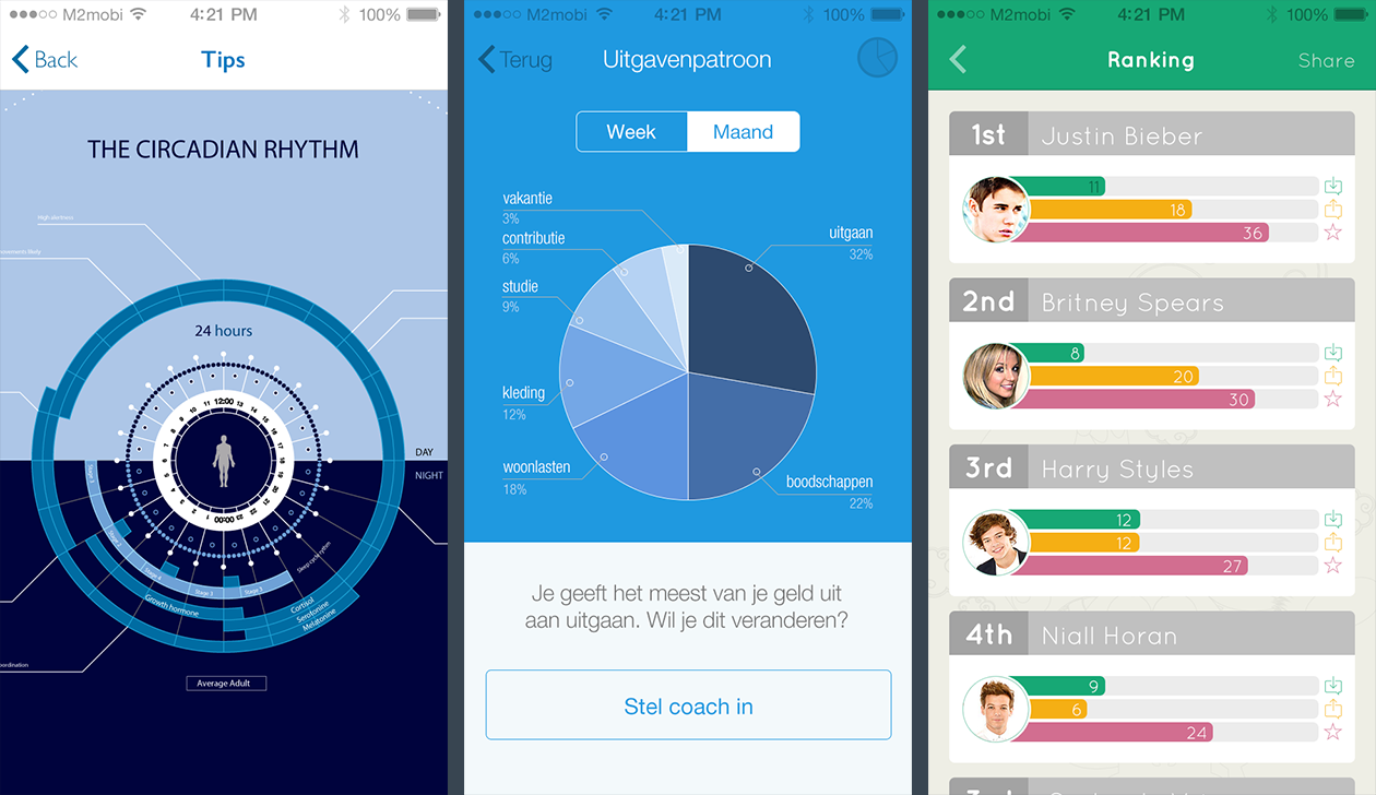
Examples of infographics and (dynamic) data visualization created for mobile applications, websites, roll-up banners and magazines. Playing with typography establishes visual hierarchy and helps people quickly read information. Turning data into visuals improves communication with strong and clear narratives.

Mobile interfaces

Clients: Several | Agency: M2mobi
A series of infographics I created between June 2013 and March 2014 for different M2mobi clients. Some information may have been omitted or changed to comply with confidentiality agreements.
Infographics
Infographics

Schiphol App infographic banner

Client: Schiphol | Agency: M2mobi
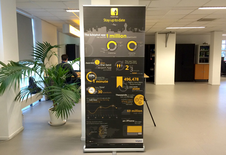
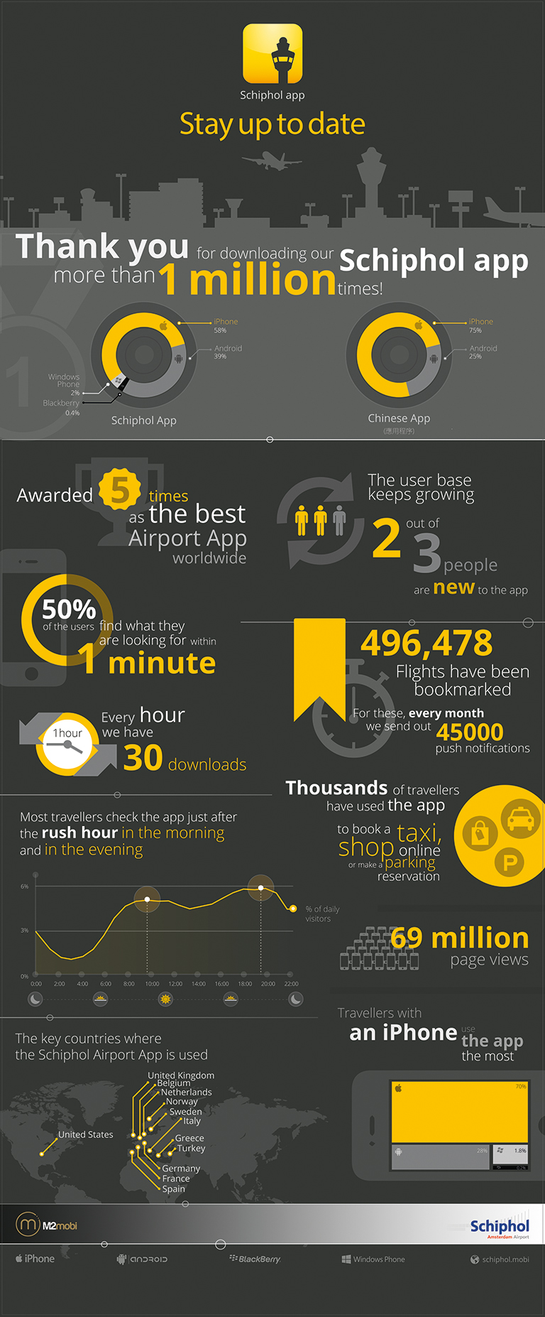
In October 2013, the Schiphol app reached a million downloads. In order to celebrate this event, I created this roll-up banner infographic with some nice information collected since the first release of the app, in February 2012.

schiphol_banner_small

Schiphol infographic banner 

TomTom Congestion Index

Company: TomTom

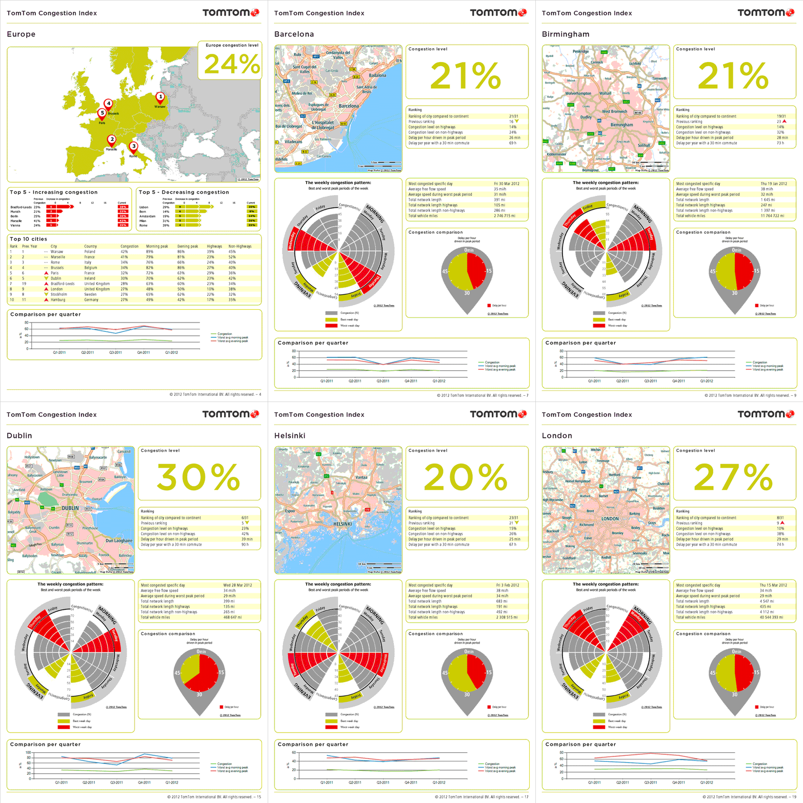
Infographics I made during the internship at TomTom from September 2011 until February 2012, showcasing the congestion levels in cities and continents worldwide. During the first months of the internship, I helped the team create visually appealing infographics that would be used on the ‘TomTom Congestion Index’, a report published each quarter by TomTom, showcasing the traffic knowledge TomTom has about worldwide congestion in cities and continents. This report covers traffic data in continents and cities, resulting on a ranking of congestion levels in urban areas. The visualizations provide more details about congestion level of each city (peaks/ free-flows), the worst weekdays (in morning and evening) and rush hour, worst period morning/evening rush hour, busiest day of the week, busiest day of the period. The European and North American Congestion Indexes can be downloaded at the site TomTom.com every quarter.

Download the Congestion Index at TomTom.com
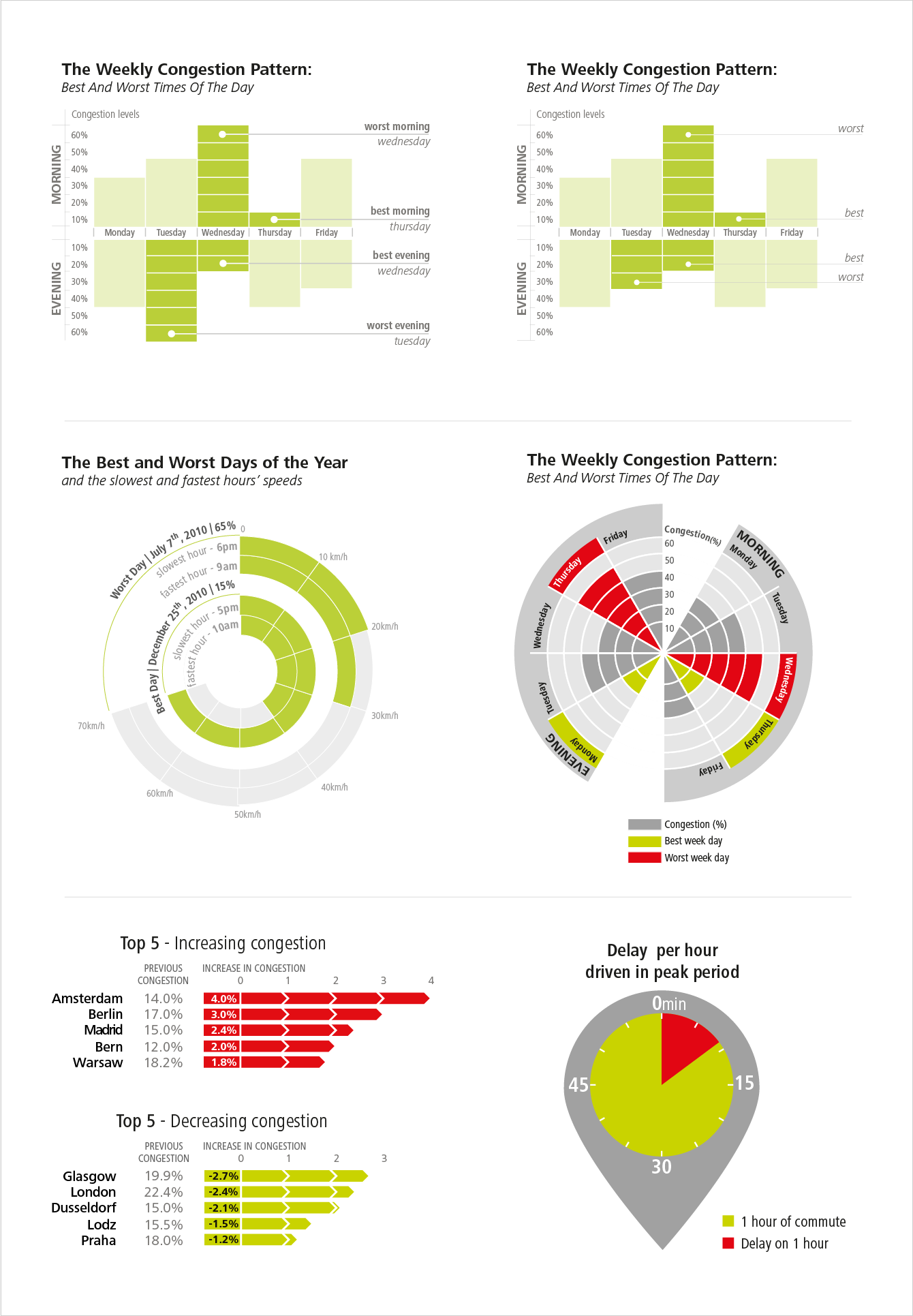
Some sketches
sketches
Congestion Index for some European cities
congestion_index_animation

TrainDelays

Willem de Kooning Academy, 2012
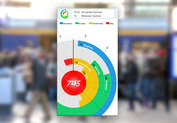
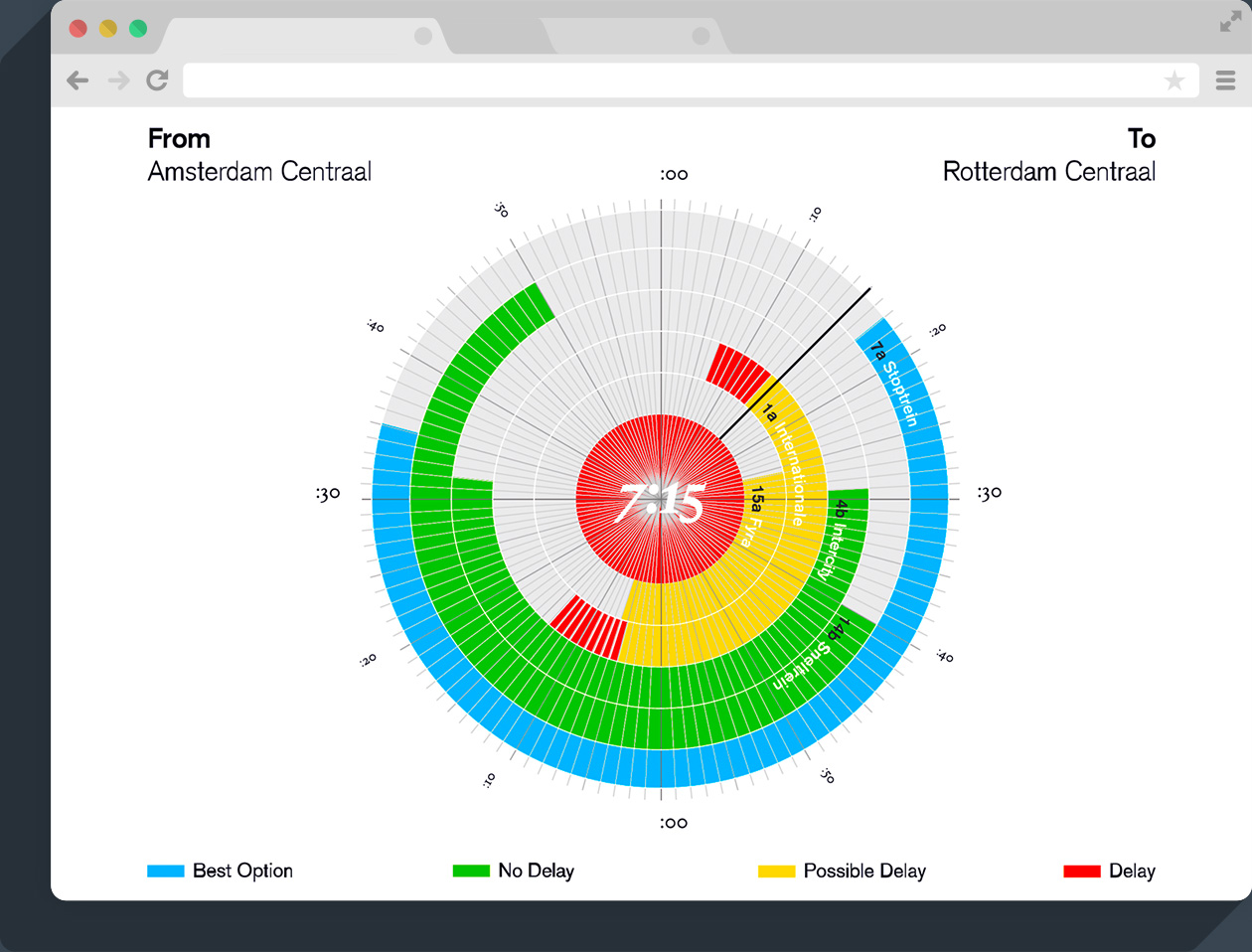
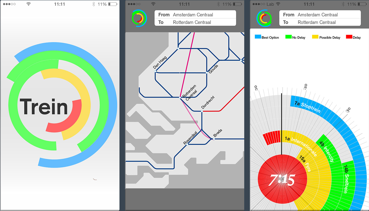
A visualization of the 5 train options to travel from Amsterdam to Rotterdam Central Stations, considering delays. The idea is to integrate all the information in one visual system, such as a clock that could offer an alternative to the menu systems currently used by most of the smartphone applications.

Train Delay Visualisation

Train Delay Infographic Website Train Delay Infographic Mobile App

The american carbon dream

Willem de Kooning Academy, 2011

A dynamic data visualisation comparing the CO2 emission between the EUA and China.  The fact that the US is a country with one of the highest number of vehicles per person and China has the highest population in the world, I made a comparison by making three questions, that are the links to the animations.

1 – What if the US had the same population as China and continued to pollute with the same proportion of cars per person?
2 – What if China had the same number of vehicles as the US, but with Chinese cars continuing to produce more CO2 than American cars?
3 – How many vehicles would the US have to reduce in order to have the same levels of CO2 emission from vehicles as China?

Click here to visit a larger version
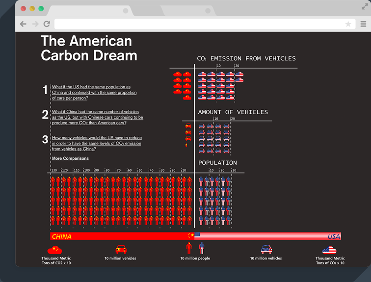
American Carbon Dream Website
American Carbon Dream Data 

Atlas of great power and responsibility

Willem de Kooning Academy, 2011

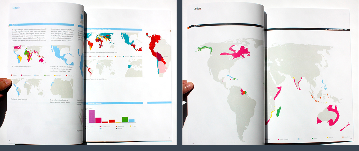
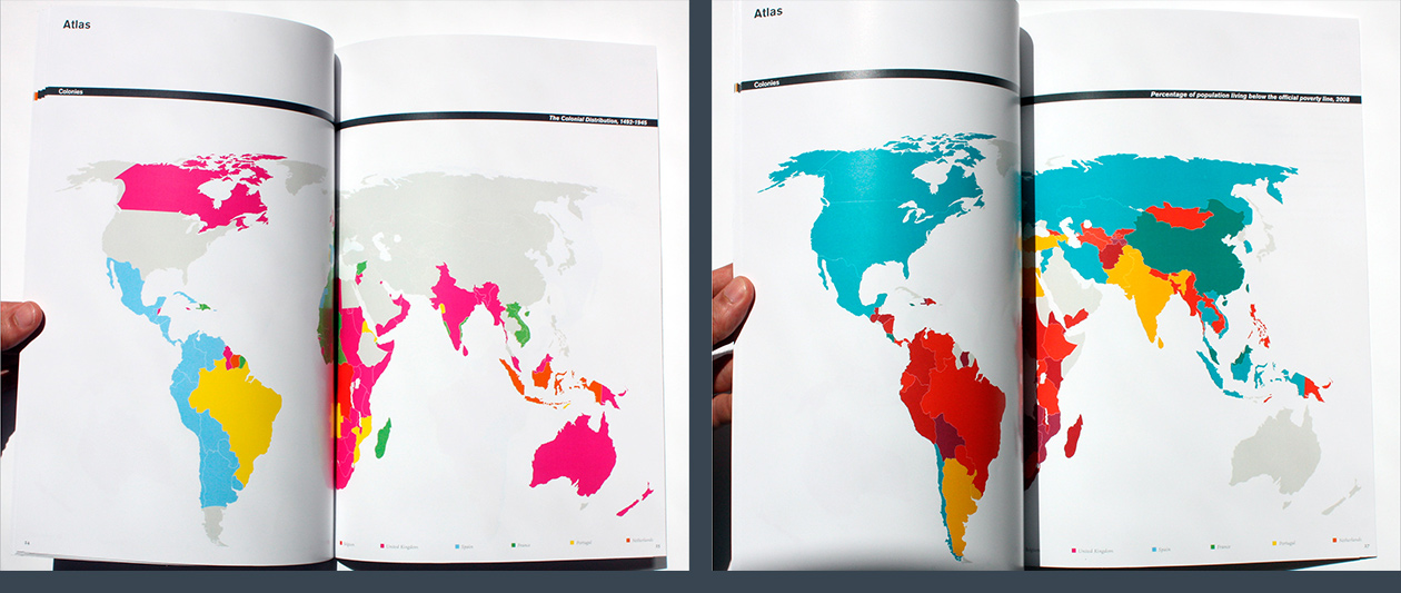
An Atlas of colonisation between 1500 and 1941. Using an infographic language, it compares the number and areas of colonies with the current poverty distribution in the world. The idea behind it is to question if there are some responsibilities from the rich countries to those that once were colonized.
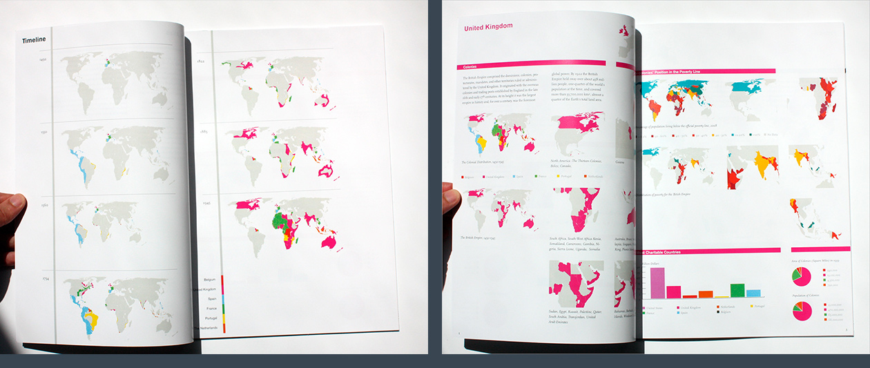
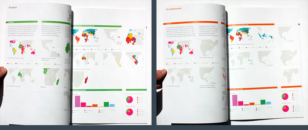
Atlas of Great Power and Responsibilities

Atlas of Great Power and Responsibilities

Atlas of Great Power and Responsibilities

Atlas of Great Power and Responsibilities

Dutch designers visualization

Willem de Kooning Academy, 2009

An Infographic relating facts about the Dutch Designers – when they were born, where they studied, which design studios they started and who they worked with. Below there is a table with the prizes each artist won and each years.

Dimensions: A0 – 841 x 1189 mm
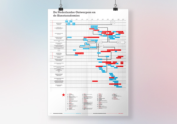
Dutch Designers Infographic


Graphic Design Projects

Graphic Design projects that I have created since 2009. They include posters, banners, typography magazine covers and books.

AMC navigation app banner

Client: AMC | Agency: M2mobi

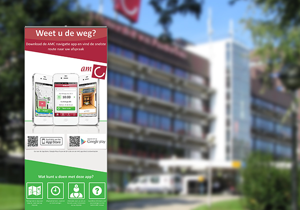
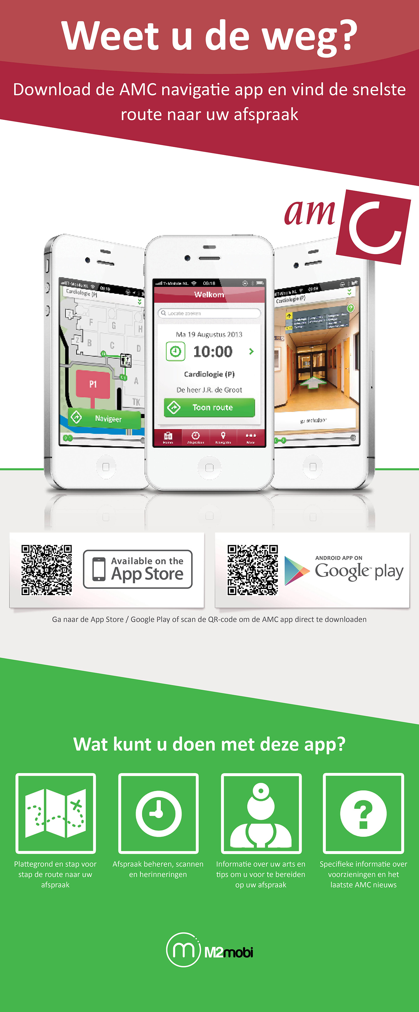
The AMC navigation app (for the Academic Medical Center, in Amsterdam) was created and developed by M2mobi in order to make a hospital visit as convenient as possible, especially by providing easy and quick directions inside the hospital. Because hospital visitors usually don’t know they can download this app or how it can be useful, I designed this roll-up banner that stays in the entrance of the hospital to promote the app and makes it easier to download it there by simply scanning the QR-code.
AMC banner
amc_banner

North Sea Jazz Festival

Willem de Kooning Academy, 2011

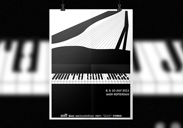
A poster I designed for the competition for the North Sea Jazz Festival 2011. It is a jazz event that happens once a year in Rotterdam, the Netherlands. On the poster, I use the shape of a piano as a window to the city, emphasising the typography on the piano, with a more classic vibe that I get from jazz.

Dimensions: A1 – 594 x 841mm

Poster for the North Sea Jazz Festival 2011

NZJ2011

Magazine cover

Willem de Kooning Academy, 2010

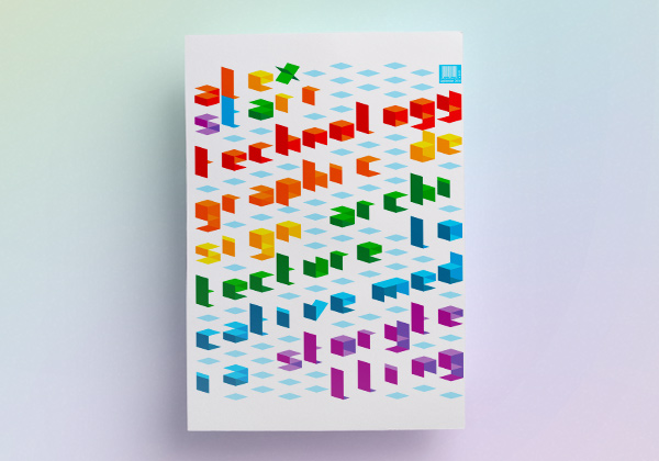
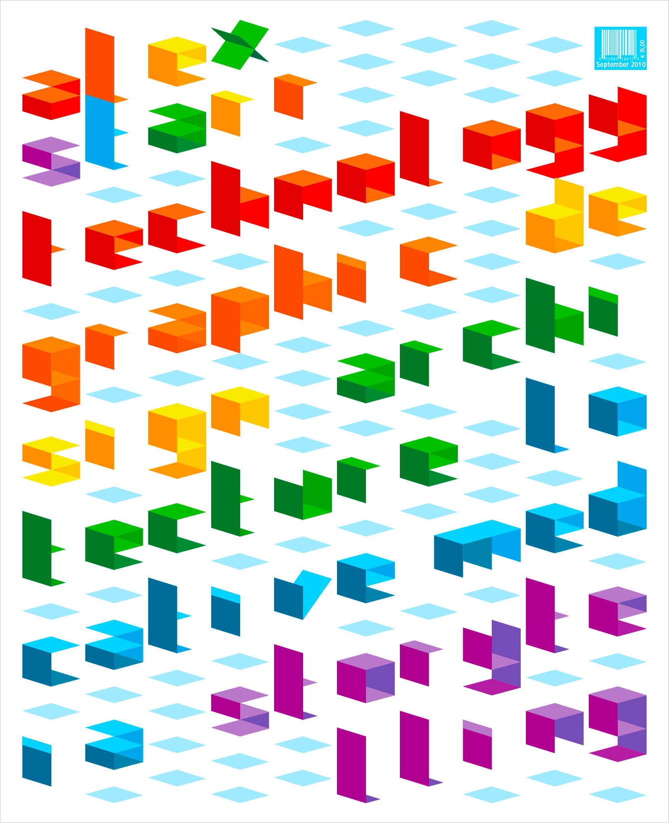
A magazine cover I designed for an introductory assignment for the typography classes at the WdKA. The ideas was simply to introduce myself to the group, so I designed a magazine cover showing, through typography, my interests for technology and the transition from architecture to graphic and information design.

Dimensions: 230 x 290 mm

Magazine Typography Cover

cover-typo 

The book I wish existed

Willem de Kooning Academy, 2010

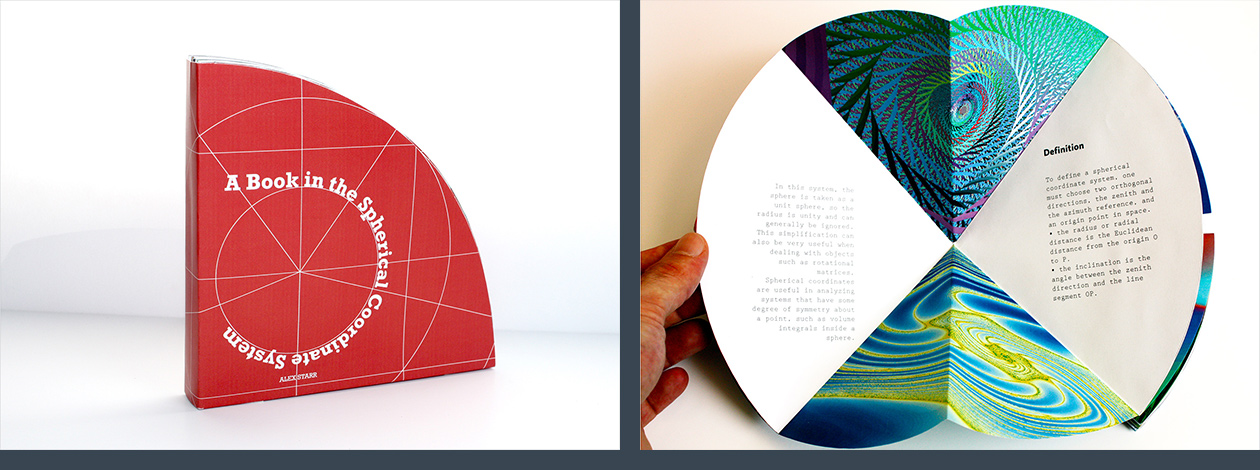
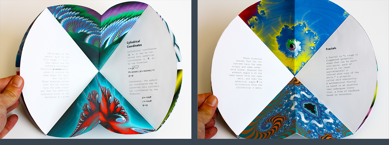
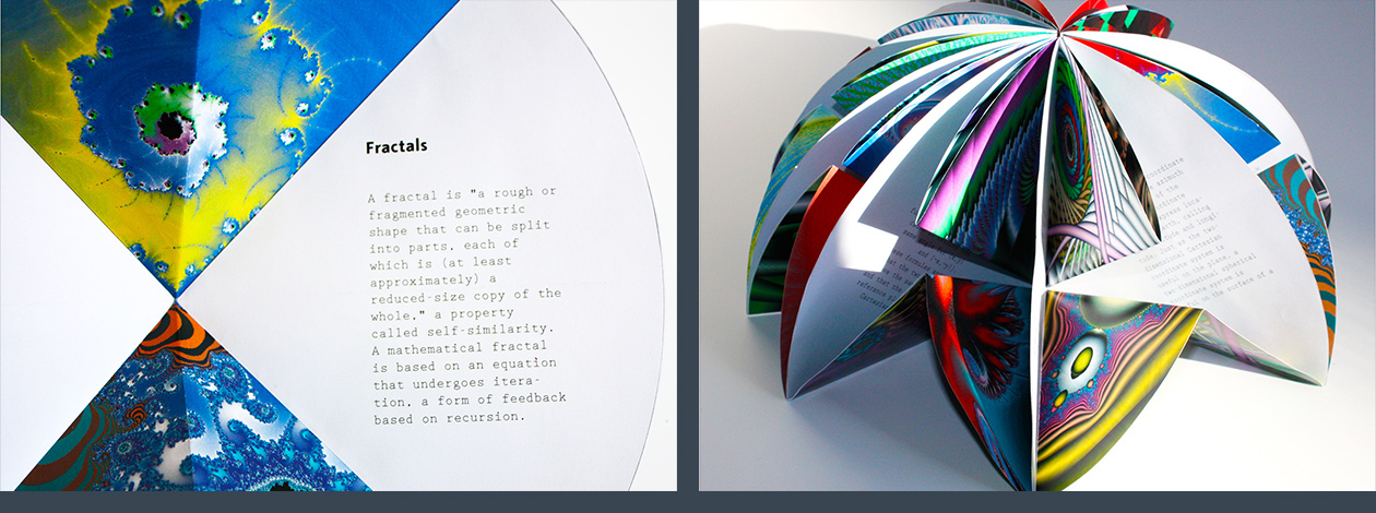
I was asked to design the book I wish existed, and I did it not in the two coordinate dimensions, but in a spherical coordinate system. It sounds geek, I know, and that’s why I will not explain in details how I created the parameters to determine the size, shape and measurements of the book. But if you are interested, I wrote a text about the Cartesian and spherical coordinates systems, I counted the number of letters, words, sentences and paragraphs of each chapter, and I used these numbers to calculate the book dimensions and to generate the fractals using a computer program. The result is a very unique and exciting shperical book, with a very mathematical, geometrical and, why not, geek vibe, that represents the book I missed.

Dimensions: 13cm radius, 13cm height

The book I wished existed

The book I wished existedThe book I wished existedThe book I wished existedThe book I wished existed