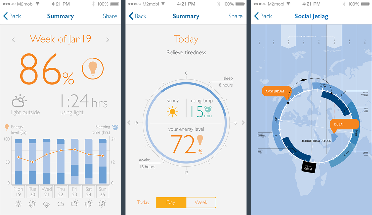
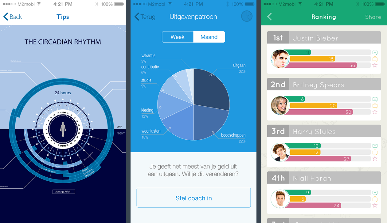
Examples of infographics and (dynamic) data visualization created for mobile applications, websites, roll-up banners and magazines. Playing with typography establishes visual hierarchy and helps people quickly read information. Turning data into visuals improves communication with strong and clear narratives.
Mobile interfaces
Clients: Several | Agency: M2mobi
A series of infographics I created between June 2013 and March 2014 for different M2mobi clients. Some information may have been omitted or changed to comply with confidentiality agreements.
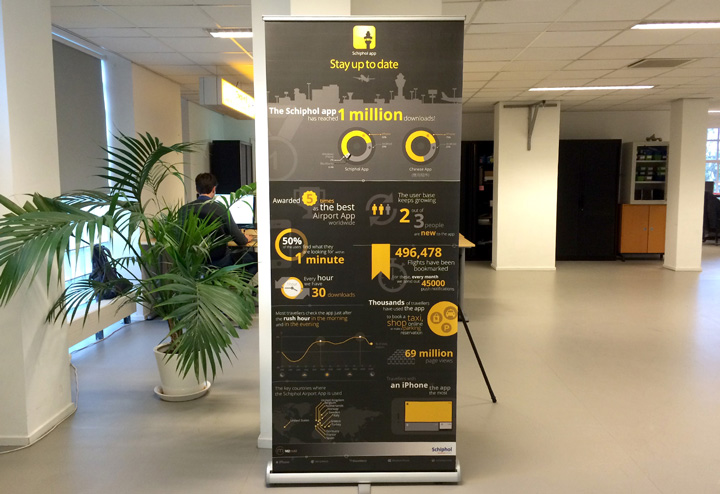
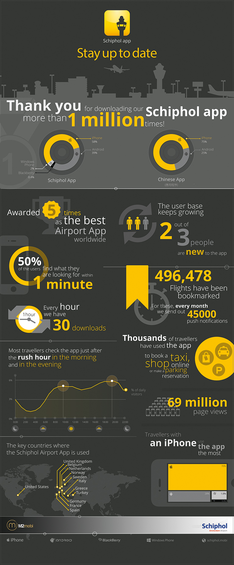
Schiphol App infographic banner
Client: Schiphol | Agency: M2mobi
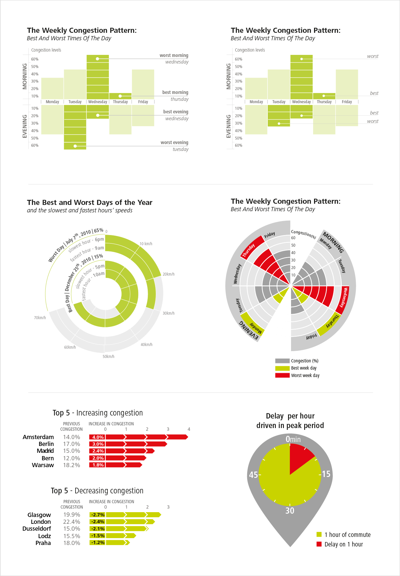
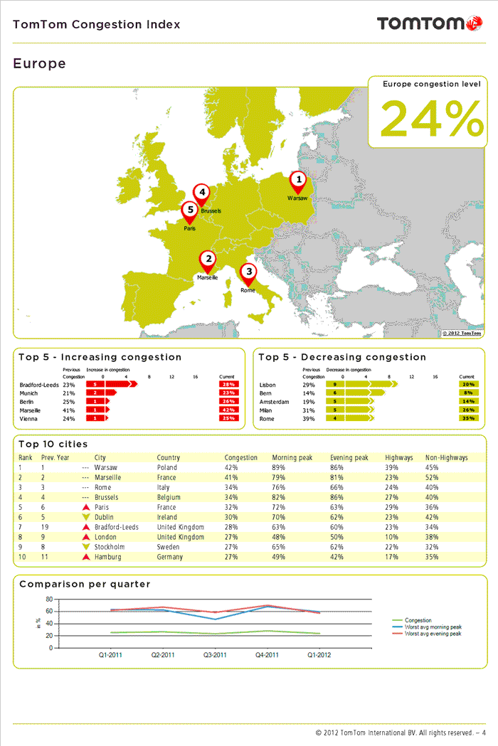
TomTom Congestion Index
Company: TomTom
Infographics I made during the internship at TomTom from September 2011 until February 2012, showcasing the congestion levels in cities and continents worldwide. During the first months of the internship, I helped the team create visually appealing infographics that would be used on the ‘TomTom Congestion Index’, a report published each quarter by TomTom, showcasing the traffic knowledge TomTom has about worldwide congestion in cities and continents. This report covers traffic data in continents and cities, resulting on a ranking of congestion levels in urban areas. The visualizations provide more details about congestion level of each city (peaks/ free-flows), the worst weekdays (in morning and evening) and rush hour, worst period morning/evening rush hour, busiest day of the week, busiest day of the period. The European and North American Congestion Indexes can be downloaded at the site TomTom.com every quarter.
Download the Congestion Index at TomTom.com
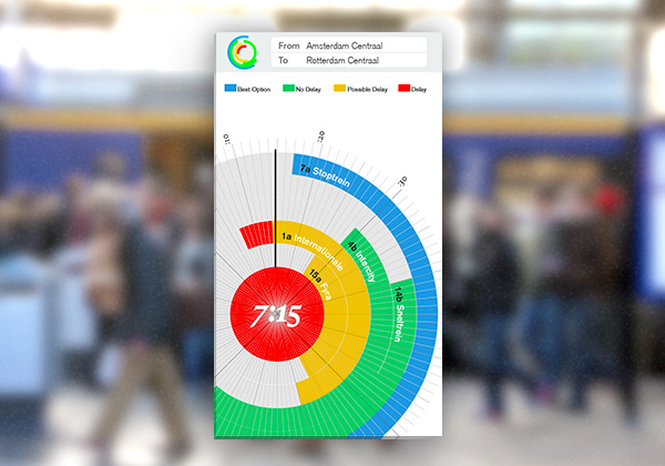
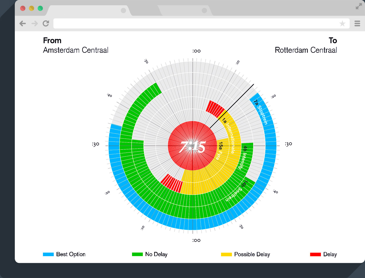
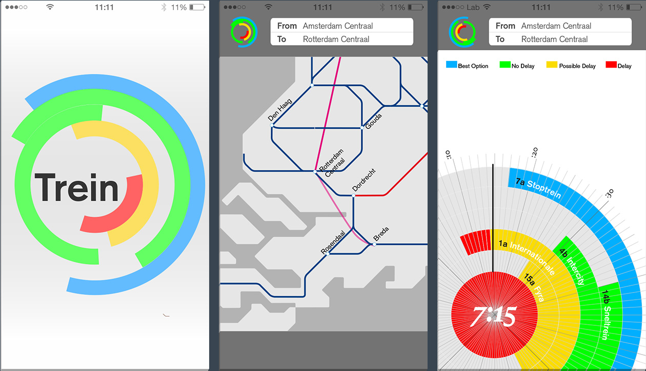
TrainDelays
Willem de Kooning Academy, 2012
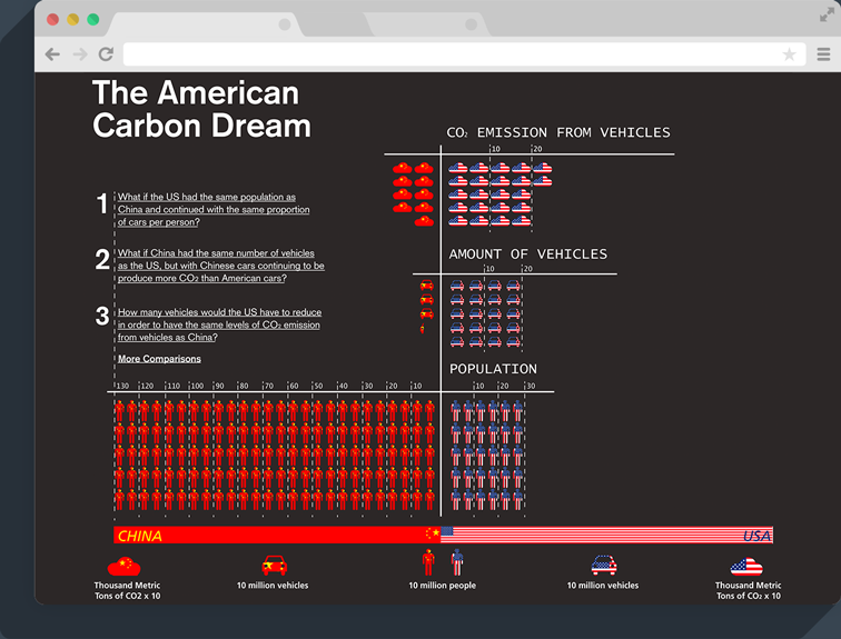
The american carbon dream
Willem de Kooning Academy, 2011
A dynamic data visualisation comparing the CO2 emission between the EUA and China. The fact that the US is a country with one of the highest number of vehicles per person and China has the highest population in the world, I made a comparison by making three questions, that are the links to the animations.
1 – What if the US had the same population as China and continued to pollute with the same proportion of cars per person?
2 – What if China had the same number of vehicles as the US, but with Chinese cars continuing to produce more CO2 than American cars?
3 – How many vehicles would the US have to reduce in order to have the same levels of CO2 emission from vehicles as China?
Click here to visit a larger version

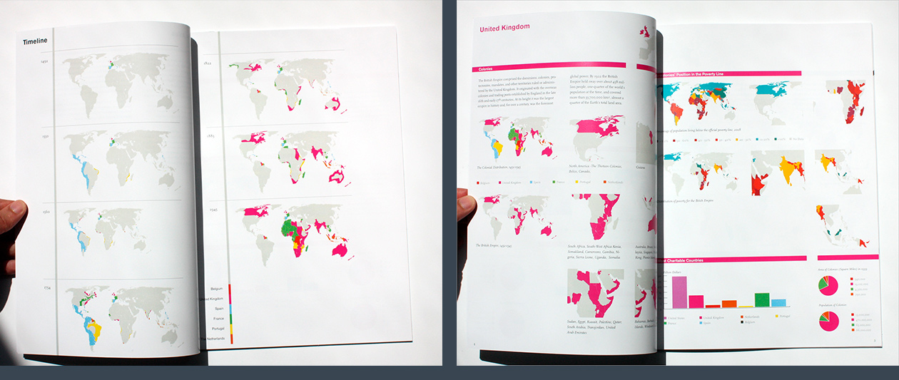
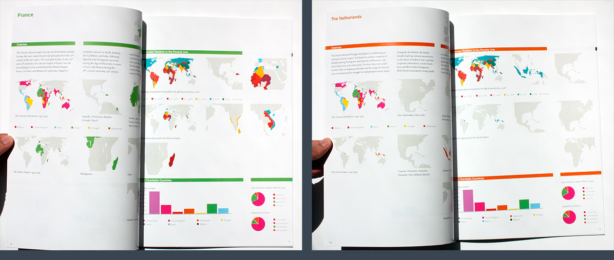
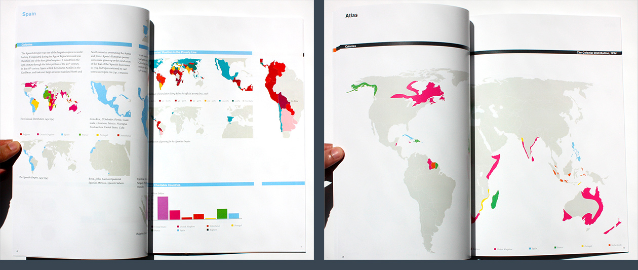
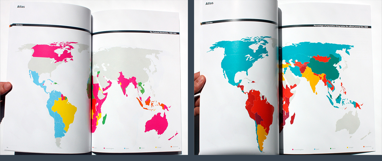
Atlas of great power and responsibility
Willem de Kooning Academy, 2011
An Atlas of colonisation between 1500 and 1941. Using an infographic language, it compares the number and areas of colonies with the current poverty distribution in the world. The idea behind it is to question if there are some responsibilities from the rich countries to those that once were colonized.
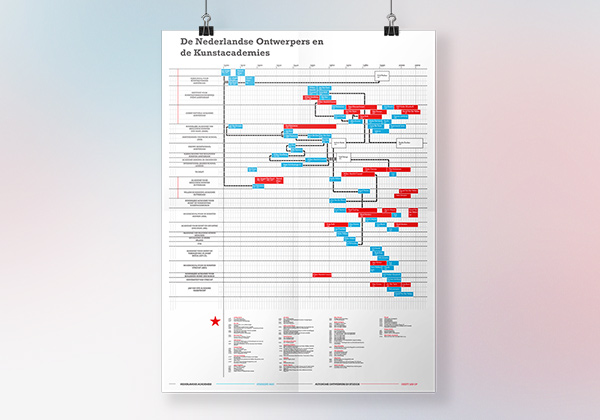
Dutch designers visualization
Willem de Kooning Academy, 2009
An Infographic relating facts about the Dutch Designers – when they were born, where they studied, which design studios they started and who they worked with. Below there is a table with the prizes each artist won and each years.
Dimensions: A0 – 841 x 1189 mm