Overview
Sjaak is an application that helps groups of friends splitting and settling bills in a fun and easy manner. This helps users who regularly make expenses in a group where someone pays the bill upfront, and then splits the bill calculating who pays what, and follows up on who has already paid and who still has to pay. The idea behind the app is that it is better if “Sjaak” is chasing the money, sending reminders to your friends after 3 days the amount owed has not been paid, instead of you having to do it yourself.
My role
I was responsible for the user experience for the iOS and Android phones e tablets applications, creating interaction proposals, wireframes and prototypes to be used in user testing, validating results and adjusting designs. Working together with stakeholders and developers following a scrum method, I was also responsible for the visual interface design, creating the visual style and designing all screens and components for the whole application. This also included creating interaction and visual interface documents and deliverables to discuss the interaction with the stakeholders and provide the assets needed to build the app.
Duration
This project took place between April 2014 and February 2015.
THE INTERACTION DESIGN
SKETCH PHASE
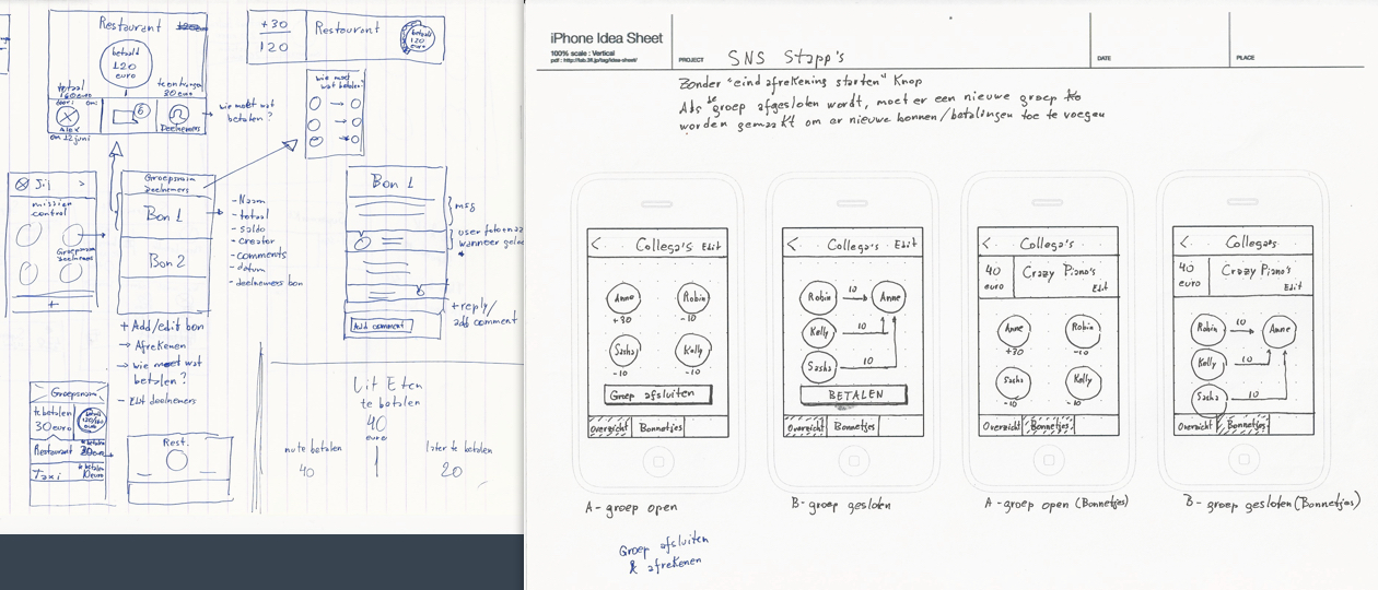
In order to define the overall structure, I started sketching on paper some ideas for navigation, functional and interactive behaviours. After that, I create wireframes to quickly test different options without the distraction of visual design and define existing steps required to complete the most general user tasks.
LOW-FIDELITY WIREFRAMES
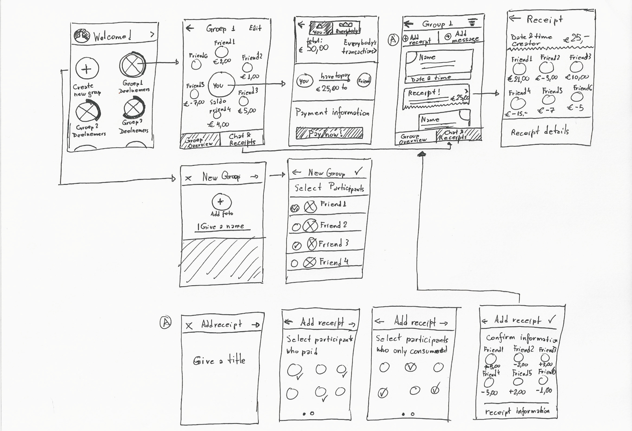
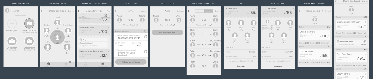
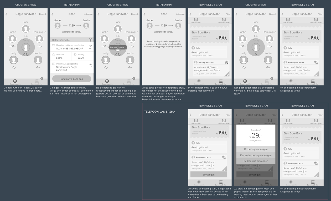
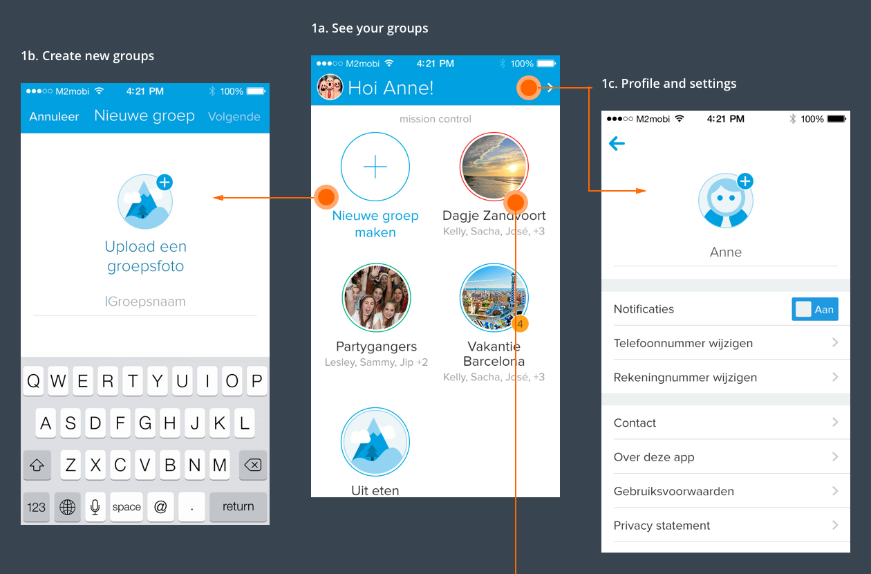
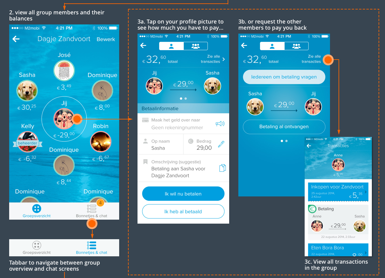
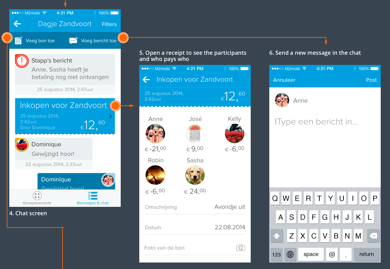
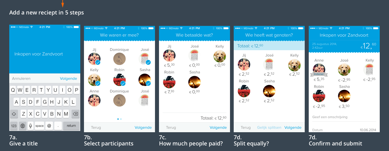
The first wireframes were high level quick mockups visualising the main screens of the app. These wireframes were useful to define which functionalities would fit each screen, and to give a better overview of the steps a user would have to make when going from creating a new group and adding friends to it, until adding a receipt, splitting it with friends and adding it to the chat group.
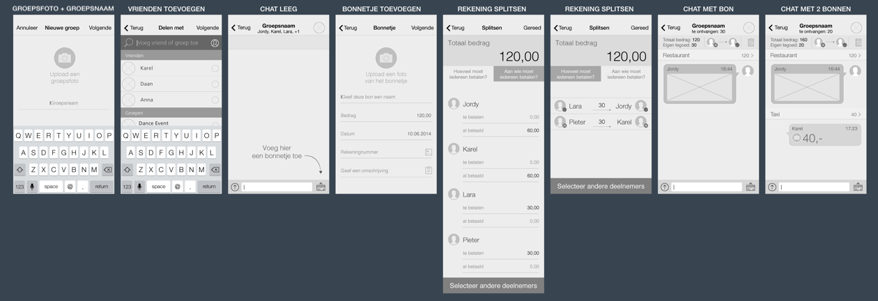
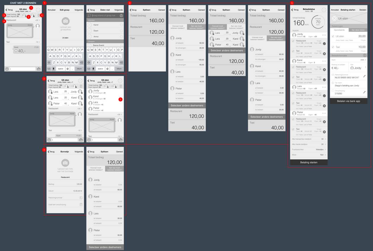
While testing and adjusting the first wireframes and getting more insight in the user needs and comments, I started creating a visual style to the app. Since the app is functional and has to be easy to download and use, I chose for a flat and clean user interface, keeping each screen simple and intuitive, and trying to avoid offering too many possible actions in one screen, thus splitting long flows in multiple screens.

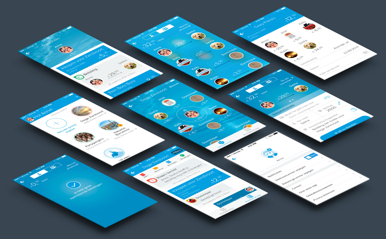
In order to get more user feedback on the interaction and visual designs, I used the most recent designs to create the screens needed to build a prototype using the online tool proto.io. These prototypes showed different navigation paths, interface component and screens designs. The users selected for the tests were asked in many cases to compare different options, taking part in A/B tests. The wireframes below were made in the last phase of the interaction design, and they show an example of high-fidelity wireframes resulting from a long process of creating, testing, validating and improving.
DETAILED DESIGNS
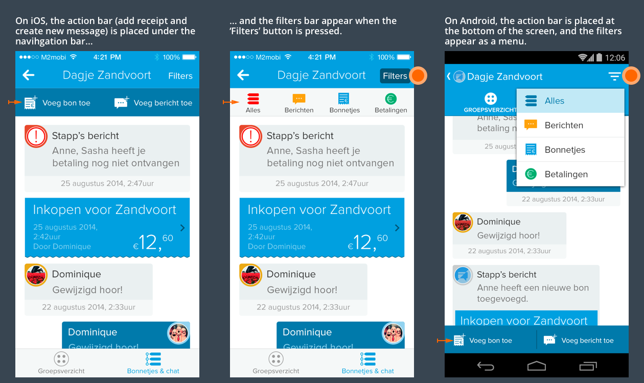
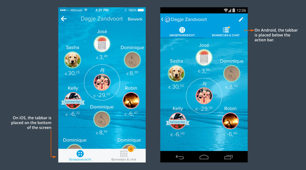
iOS and Android tabbar navigation
iOS and Android toolbars displaying options to add a payment on chat and create a message. On iOS, this bar is located under the navigation bar, while on Android it’s placed on the bottom of the screen. On iOS, the filters appear in a bar that can be toggled from the bottom on the navigation bar. On Android, this filters appear in a foldout menu.