VGZ Zorgverzekeraar (Dutch health insurance company) came up with the idea of creating an app to help people dealing with stress and developing self-consciousness. This is my story of how I made a positive difference to everyday life of people that wanted to achieve a more relaxed and peaceful life through the design of the VGZ Mindfulness Coach app.
Overview
VGZ Mindfulness coach app is an initiative of VGZ for people who wants to have more control over their lives, increase self-awareness and live more here and now. It’s a free application, that contains exercises that teach you how to relax and meditate. Platforms: iOS and Android phones and tablets.
Duration
This project took place between June 2013 and January 2014.
My role
I was responsible for the experience strategy, interaction, visual design and copywriting of the iOS and Android apps, for phones and tablets. I worked together with Beatriz Arias, who designed the initial phase of interaction, and teamed up with the client to understand the concept of the application, define the user stories and apply the VGZ brand identity in the design of the interfaces.
THE INTERACTION DESIGN
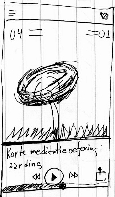
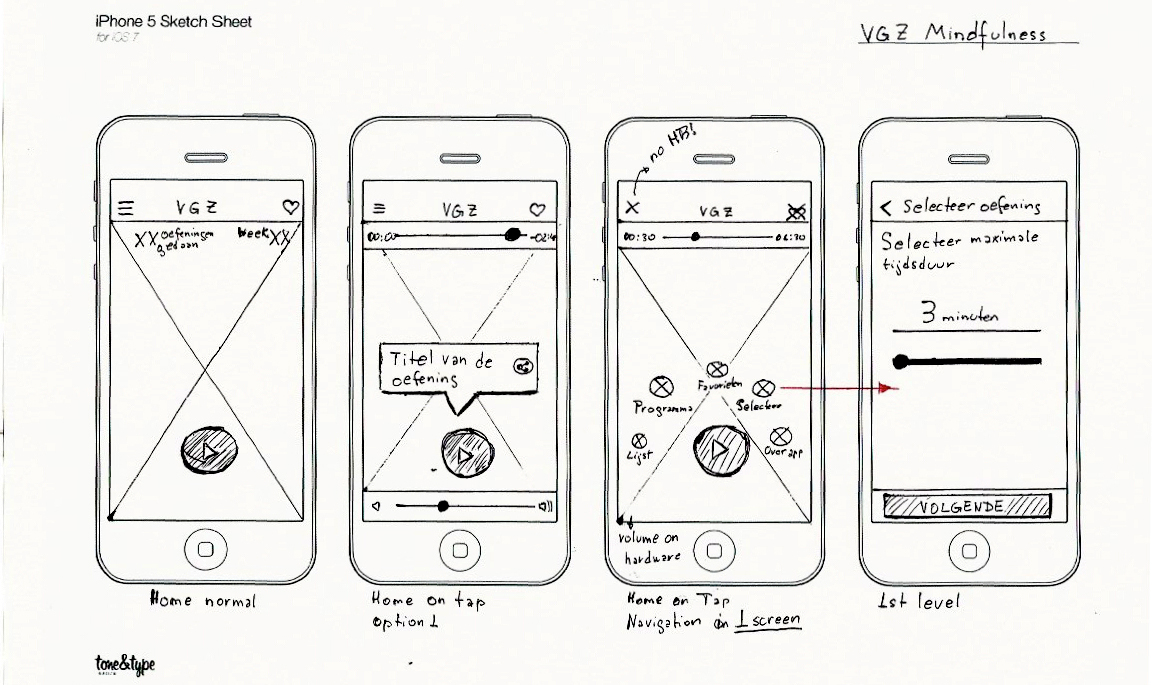
In order to define the overall structure of the experience, I started sketching and storyboarding on paper, visualizing ideas about the arrangement of UI, functional and data elements, and interactive behaviours. After that, I create wireframes to quickly test different options of information architecture and layout without the distraction of visual design and illustrate existing steps required to complete a user action.
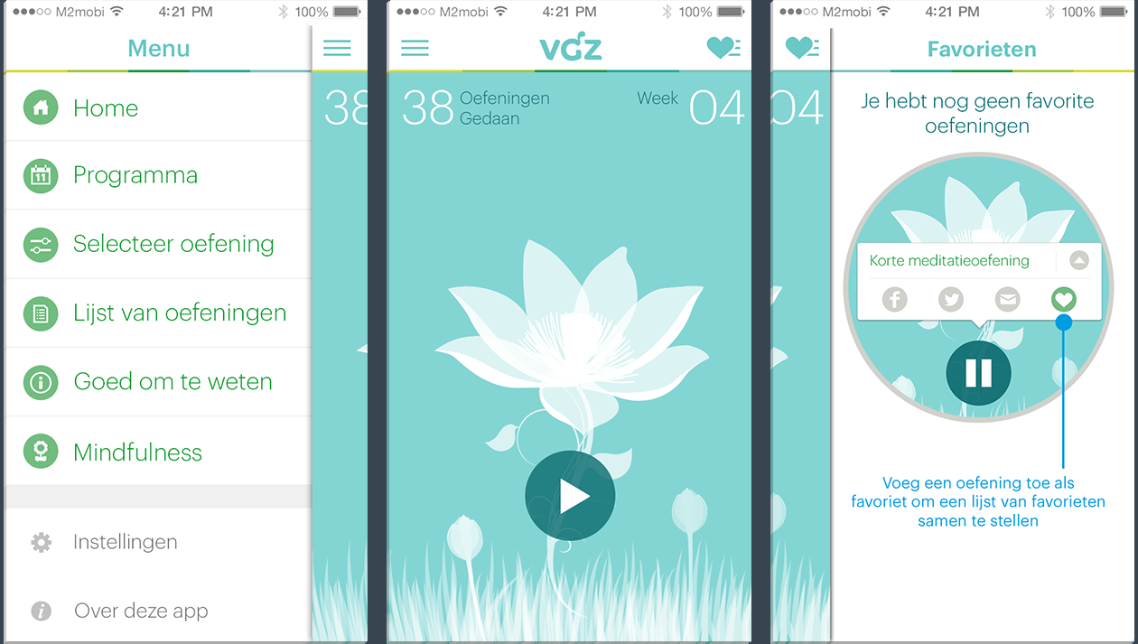
The use of drawers for the navigation became very popular in this time with Facebook adopting it in it’s app. On my first sketches, I choose to create one button on the main screen through which the user could navigate to other sections, keeping the interface clean and the navigation intuitive in case the user is listening to an exercise and practicing a meditation exercise. However, it was one of the requirements of the client that sections such as about the app, share the app and give feedback shouldn’t be hidden under one “more” section, but visible in a drawer as in Facebook.
THE INTERACTION FRAMEWORK
I used Balsamiq Mockup to communicate the app’s interactions, and created animated gif’s in Adobe Photoshop to visualize animations and transitions. These animations and transitions were designed to reinforce context and create an engaging and compelling interface, while keeping it peaceful.
MOBILE PROTOTYPING WITH AXURE RP
Axure proved to be the best tool of choice for prototyping. Because of tight timelines we chose to develop a high‐fidelity prototype already using first versions of interface design, which we also wanted to validate. The prototype was a powerful tool in allowing us to gain feedback from users and approval from both our client and development partner early on.
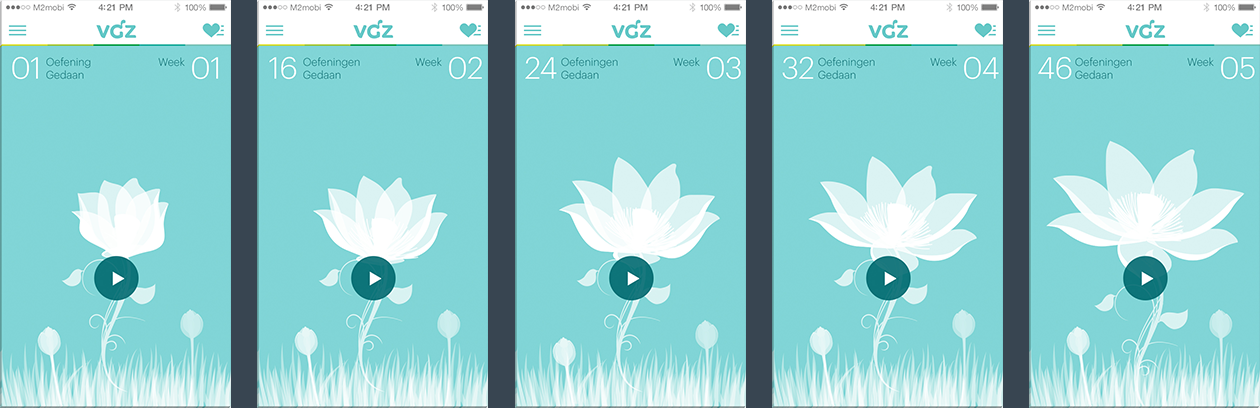
Tapping the main screen shows the track name, audio and volume controllers. After 5 seconds they slide back. Tapping the hamburger button opens the drawer, though which the user can navigate to the other sections of the app. The heart button on the top right opens the favourite list.
The track name, audio and volume controllers are always visible in the main screen. Tapping the hamburger button animates the icons though which the user can navigate to the other sections of the app, including the favourite list. Sections such as ‘about this app’ and ‘give feedback’ could be placed under the ‘more’ section.
DETAILED DESIGN
The interface design strives to be peaceful, removing unnecessary elements applying necessary elements to be succinct and make sense. The design is uncluttered, clean, large and well spaced. Colors and typography are translated from the VGZ brand and visual identity.
BRAND AND EXPERIENCE REQUIREMENTS
To communicate the personality of the app to our client and team, I visualized many possibilities of applying the VGZ brand and visual identity to create a peaceful interface and experience. Since the beginning of the process, I helped the client understand that both interaction and visual designs should conforme to iOS and Android’s guidelines, as it is recognizable by users of both platforms and is easier scale for future releases.
DESIGNED TO BE PEACEFUL
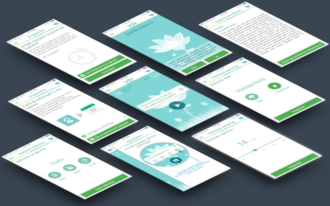
The main screen has been designed to keep users free from distraction, but allowing them to quick access primary functions of the application. As one of the challenges and requirements was to avoid pushing users to some sort of competition with themselves, I choose to slowly animate a flower on the main screen to engage users on a deeper level, creating an emotional connection. Every time the user enters a new phase of the program, the lotus flower grows in the home screen. This process encourages users to keep completing exercises without stress.
NAVIGATION
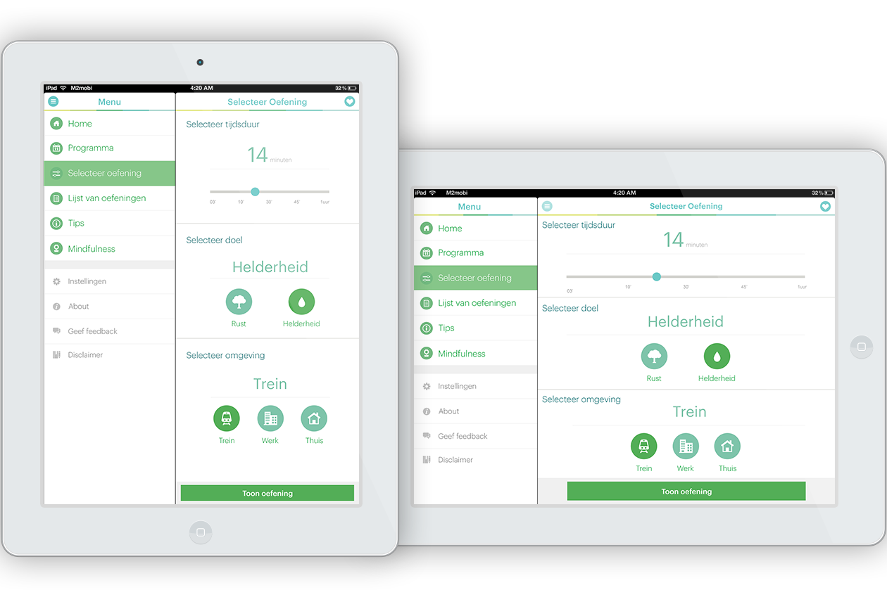
SELECTING EXERCISES
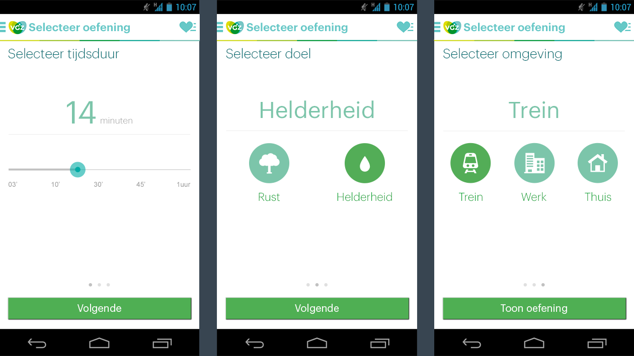
Selecting and playing exercises should be intuitive, quick and fun. There were four main user cases, which resulted in four flows:
User finishes an exercise and the next can be selected from the main screen
User follows the program and exports to calendar
User selects aleatory exercises from the list containing all exercises sorted alphabetically
User selects based on duration, environment and purpose
TABLET SPLIT VIEW