The TNT app is a business-to-business application designed to enable TNT senders and receivers to easily and conveniently stay up to date and track their shipments anytime and anywhere, even when they are on the road.
The main goal of this app is to reduce tracking calls to customer service by creating easy to use functionalities, clear messages and the possibility of answering any question a user may have. Besides, it is focused on the entire journey from sender to receiver, as well as back from receiver to sender in the case of returns, creating a more personal approach than the isolating journey from sender to TNT or TNT to receiver.
Overview
The mobile team consisted of a Product Owner, Scrum Master, UX designer, UI designer (me!), iOS and Android developers and tester, guided by an Agile development approach: continuous fast development, validated by users and stakeholders, allowing us to dynamically adjust to customer demands in delivering features.
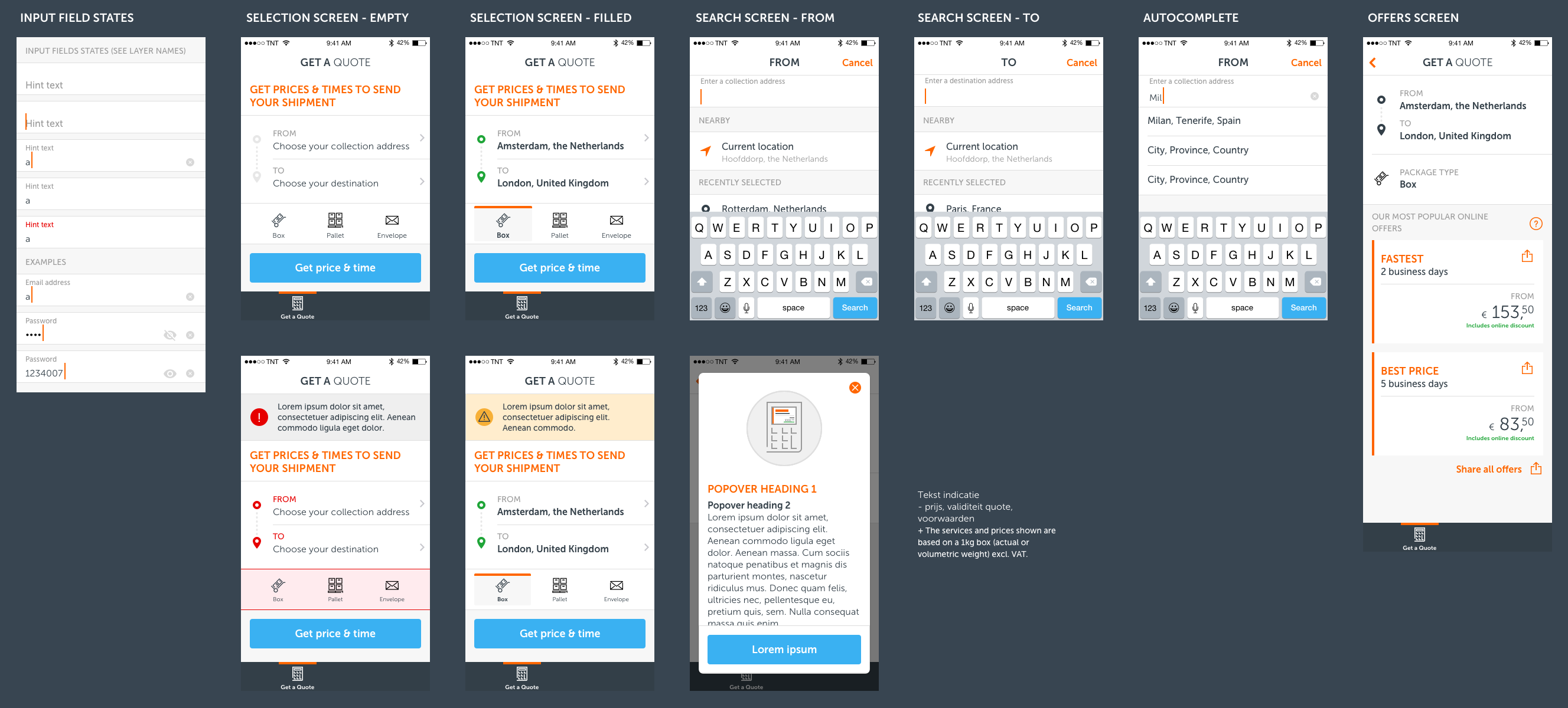
The first release of the app included only basic functionalities, such as Track&Trace and an FAQ section, initially to a limited group of users in four countries. This allowed us to start learning from our customers immediately and at an early stage, gathering feedback and tracking usage and KPI’s from the very beginning. This first release was available to iOS and Android mobile phones. The next releases continuously added new functionalities – such as Get a Quote – as well as new device options, such as iOS and Android tablets and Apple WatchOS and Android Wear support, rolling out in 33 different languages (including right-to-left).
My role
I was responsible for the user interface design of the iOS and Android apps, for phones, tablets and wearables.
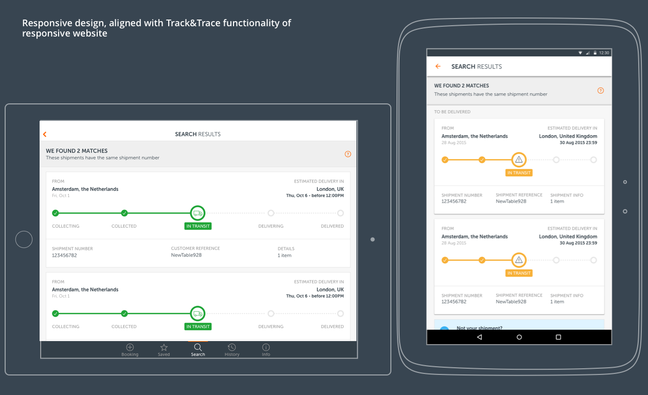
I worked together with other designers involved in the responsive website and MyTNT environment, but especially with the team responsible for the Track&Trace section of the responsive website, in order to align the user experience and look and feel of the functionality across all different platforms, at the same time translating the flows and components to fit the mobile guidelines and patterns, creating a strong mobile experience.
I also worked together with the marketing team on applying the TNT brand identity on the mobile interface design and creating a style guide, with the developers on specs and deliverables, and with the content team on short and relevant copy for small screens.
Duration
This project took place between September 2015 and March 2016.
THE INTERACTION DESIGN
DEFINING THE MAIN SCREENS AND SECTIONS
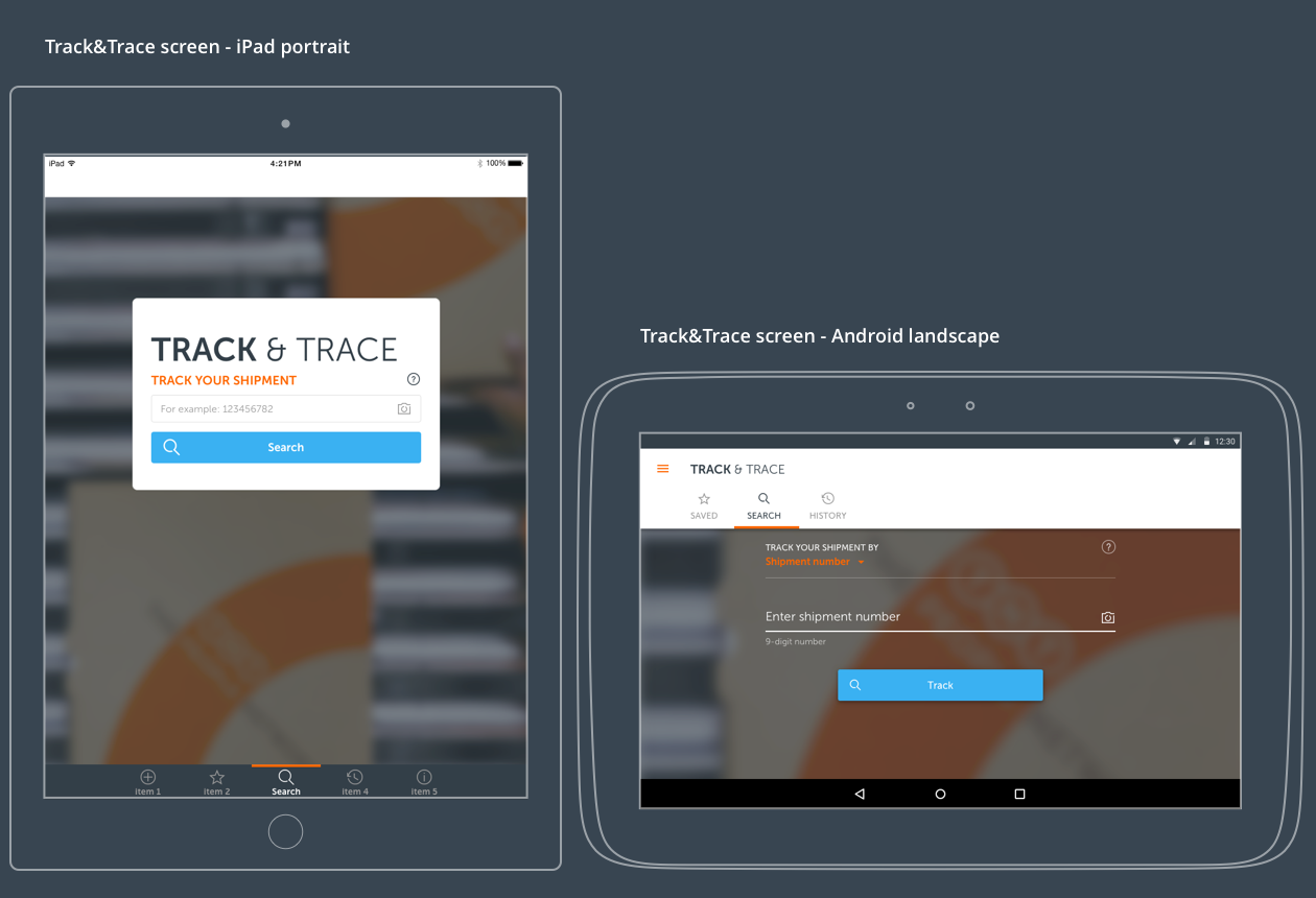
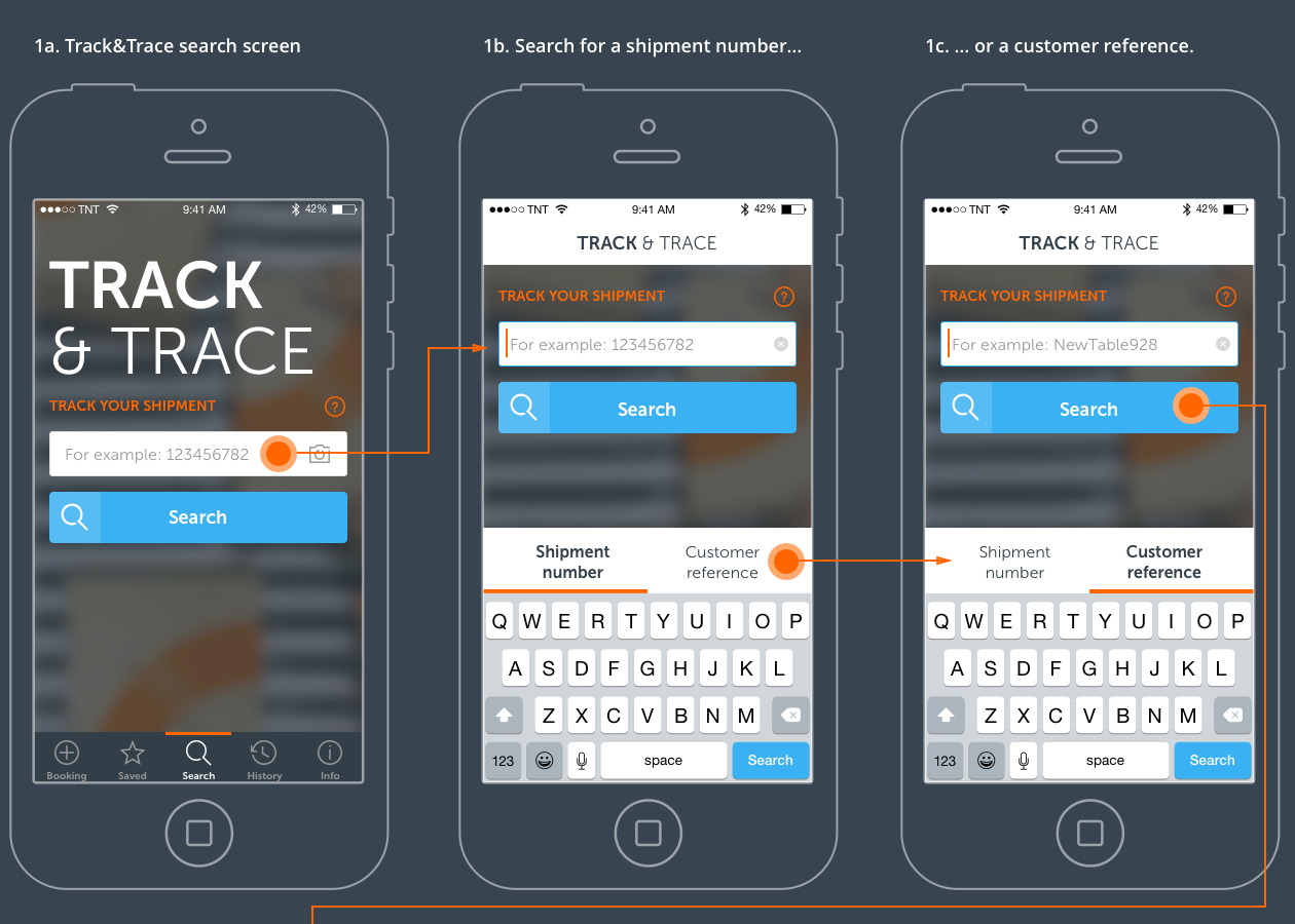
For the first release of the app, which included only the Track&Trace functionality and an FAQ section, I and the team took the online experience and backend structure as a starting point to design logical flows and navigation that would suit the iOS and Android mobile guidelines and, at the same time, deliver a strong mobile user experience with an easy to use application.
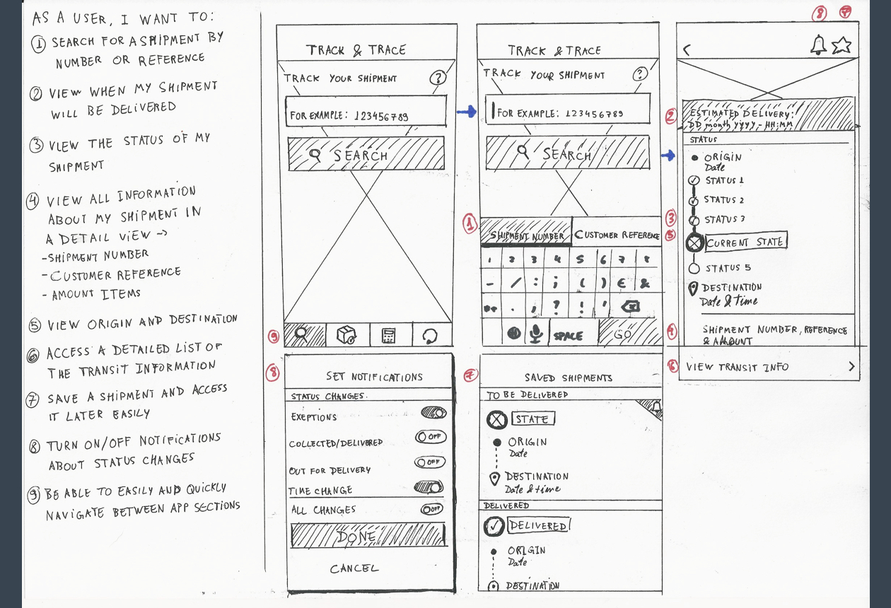
NAVIGATION
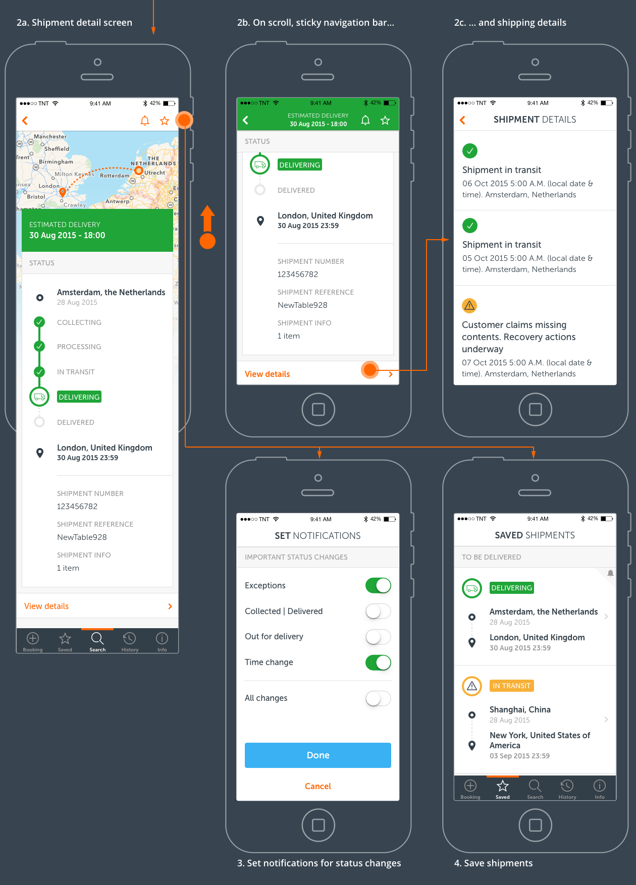
After defining the main sections and steps, we created two journey flows leading from search screen to shipment detail screen. These two flows were prototyped and tested in order to collect user feedback and validate our ideas.
The flow on the left consists in a tabbar navigation structure and a search screen out of which the user can navigate to the other sections – results and shipment detail – in a back and forward pattern. The screen on the right consists in a flow closer to the iOS search pattern, basically starting from a screen with a search field that would slide up to the navigation bar and display the results directly under it.
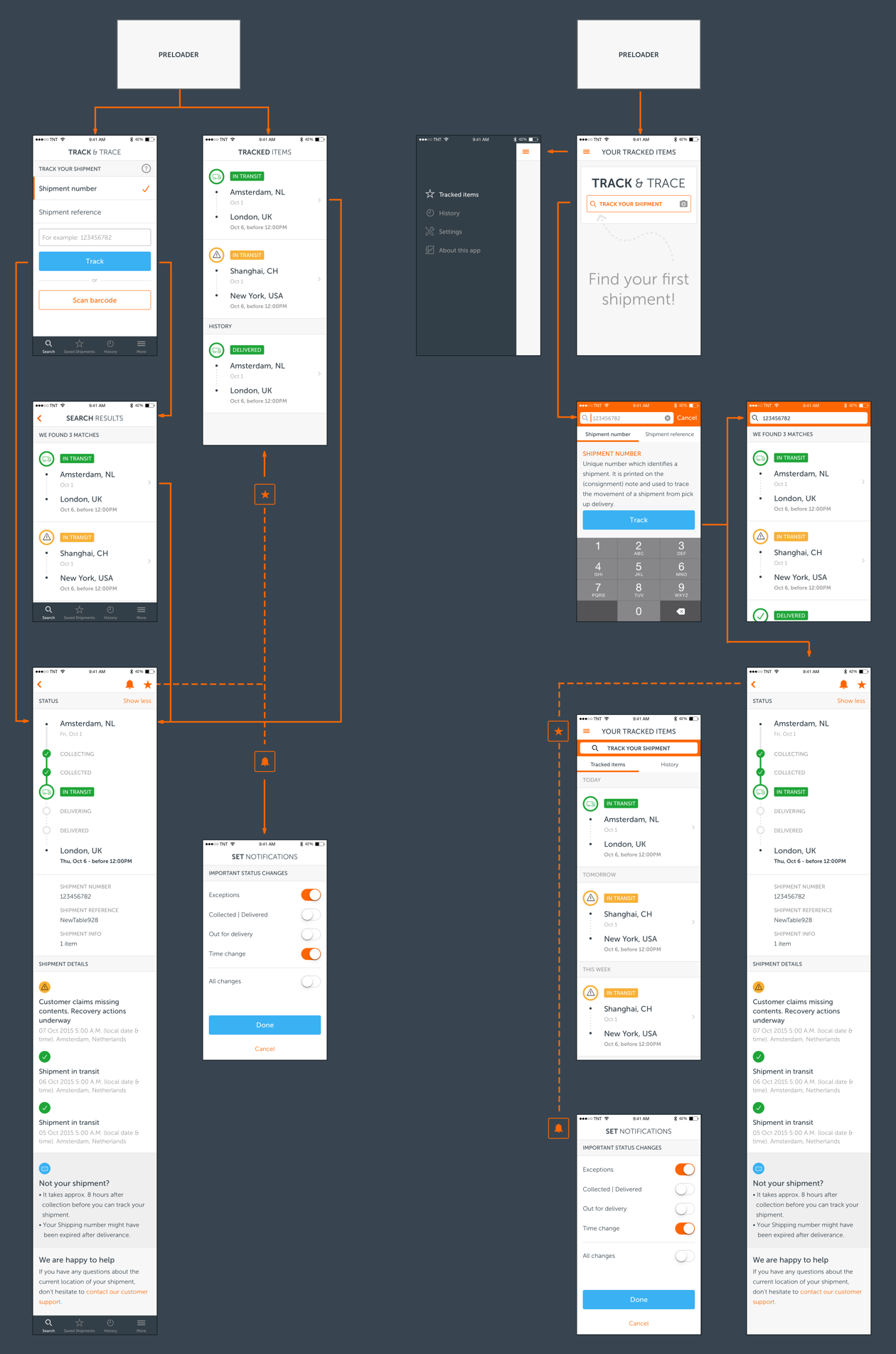
The flow on the left was the one that users found the easiest and most logical. It was clear in which step of the search they were and how to go back and forward in the flow. Users found the flow on the right to be more difficult. For example, they found it less clear that they had to dismiss the search field on the navigation bar to go back to the search screen, but they saw the persistence of the search feature in all main sections as an advantage of this option.
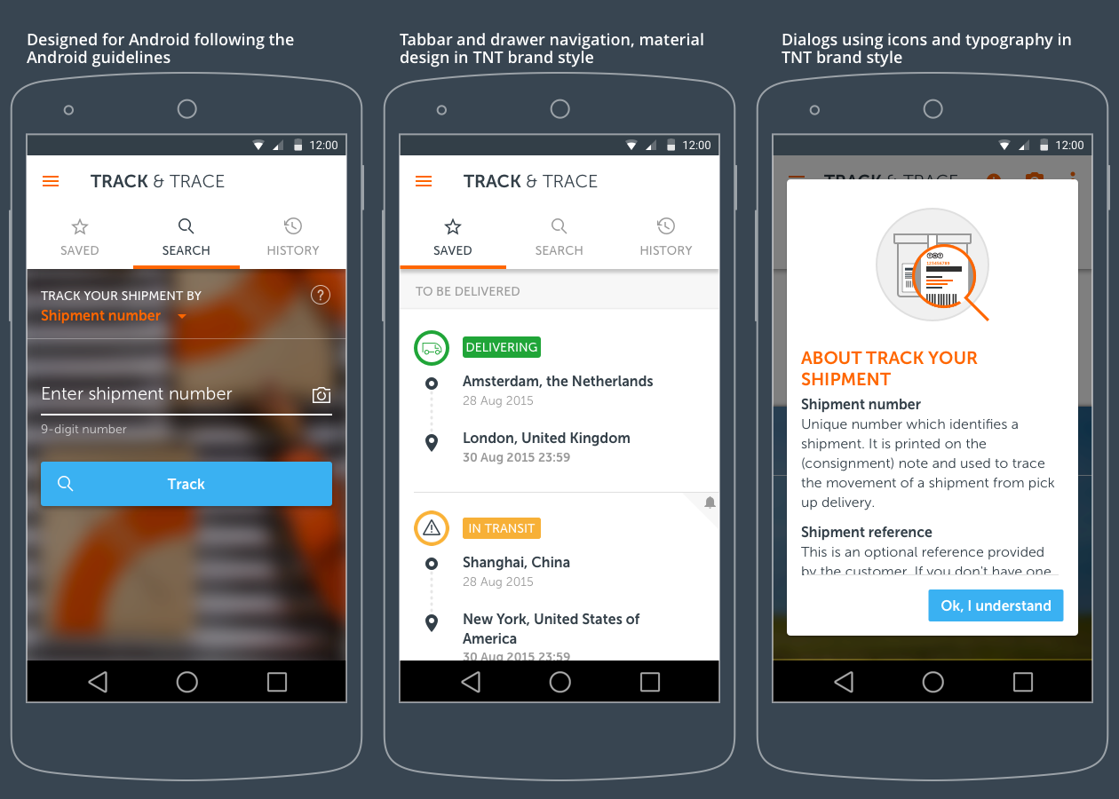
From this experiment, we also adopted a tabbar navigation for iOS, and a combination of side navigation (drawer) and tabbar for Android, aligned with the guidelines of both operational systems and ensuring usability for both iOS and Android users.
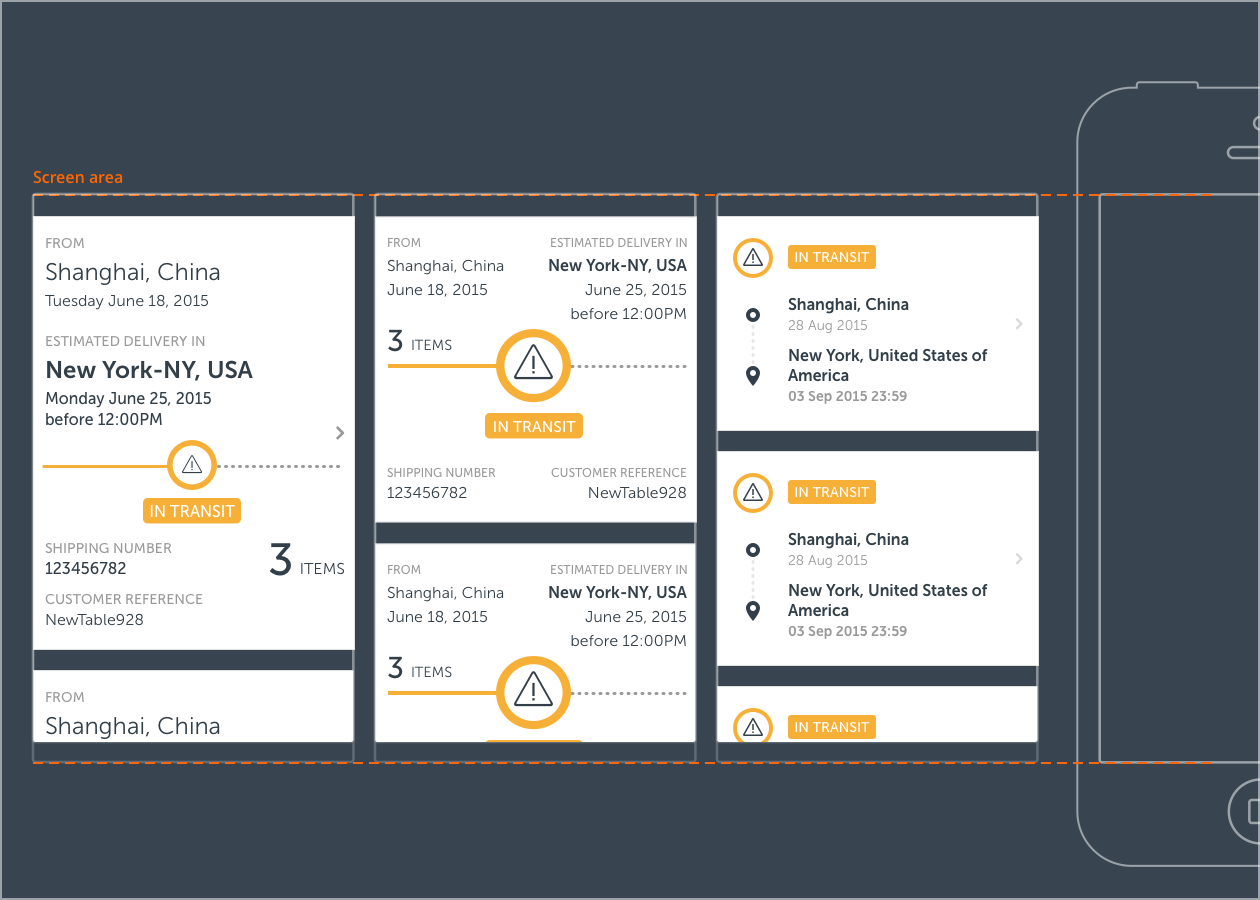
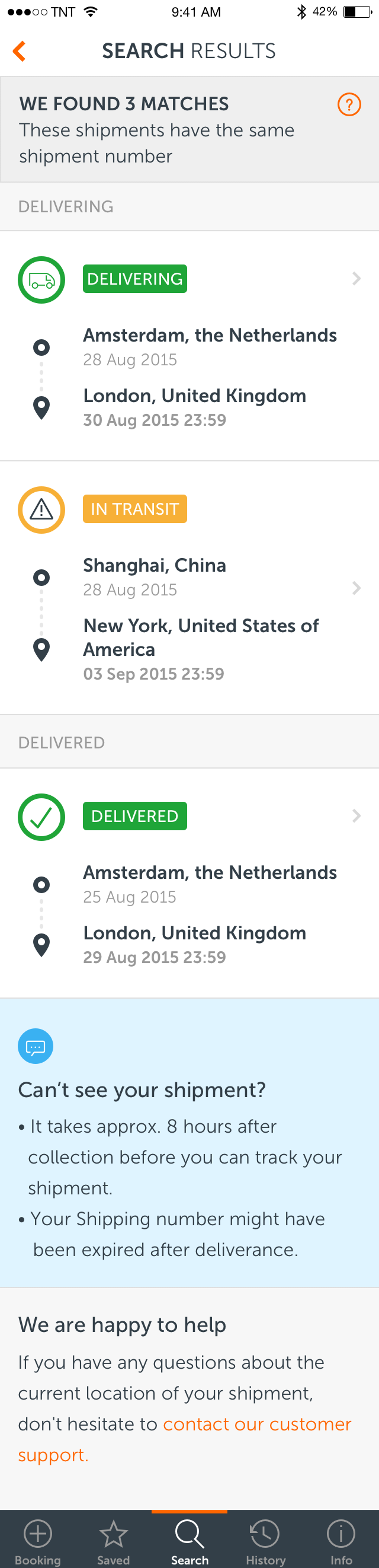
FINDING YOUR SHIPMENTOne of the challenges we faced in this project was the fact that the shipment numbers were not unique, which represented an issue in our vision on creating an easy-to-use app. A provisory solution would consist on displaying a list of results, on which the user would have to find his shipment quick and easily. This list would have to consist of compact rows, displaying only information users need to recognise their shipments. Therefore, a set of options was created in order to validate which information was relevant for each persona in order to recognise the shipment, once this elements would define the visual hierarchy of the design of this row.
Below a few design variations for shipment rows used to validate which information was necessary to quickly identify a shipment.
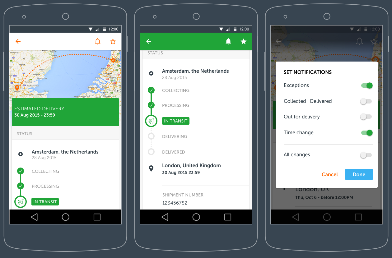
USER INTERFACE DESIGN
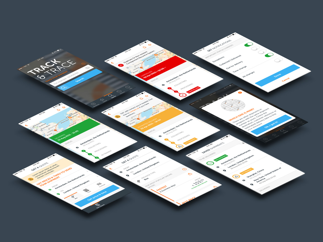
TRACK & TRACE
GET A QUOTE
ANDROID PATTERNS
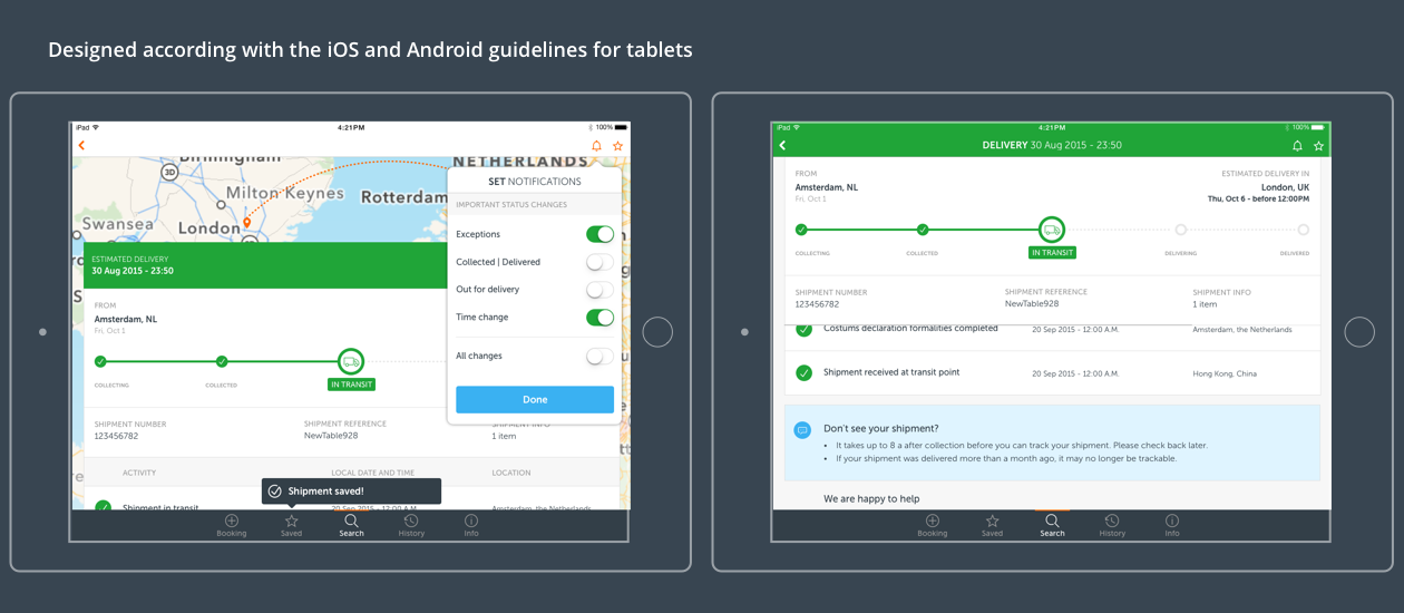
DESIGNED FOR TABLET