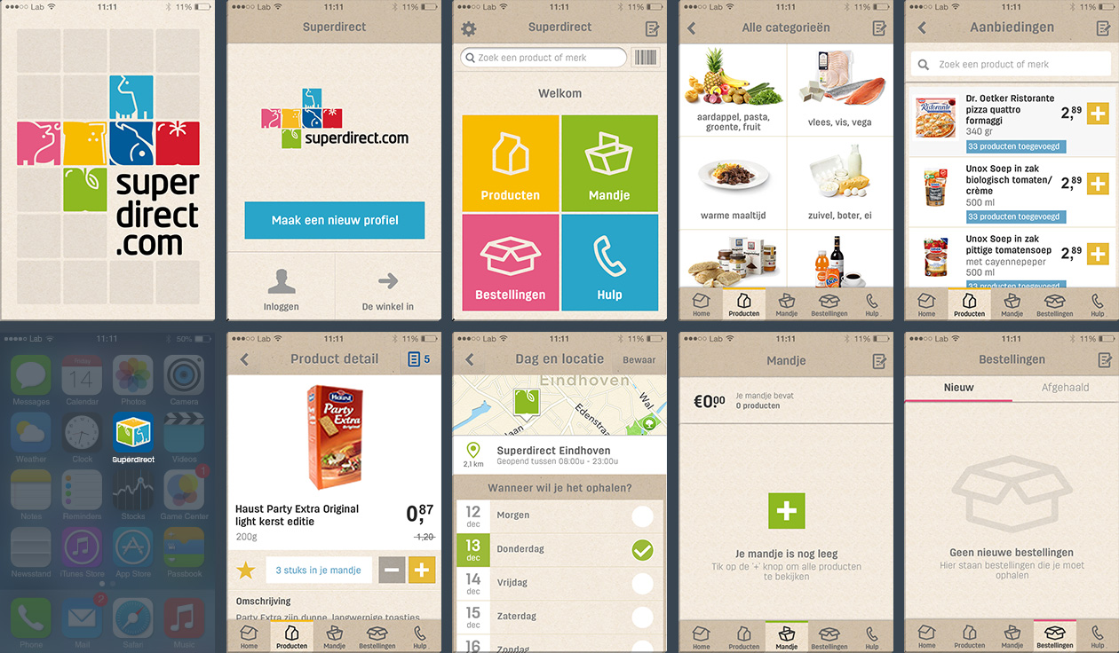
PROJECT 1 – The FedEx app
The FedEx mobile app allows users to create domestic and international shipments, get rates, find drop-off locations, get real-time alerts on shipping and deliveries, and more. All from your phone. The app is available for iOS and Android, for phones, tablets and wearables. In June 2020, there were 2,2 million engaged users in total.
Overview
The mobile team located in Amsterdam (actually, Hoofddorp) consisted of a Product Owner, UX/UI designer (me!), iOS and Android developers and a tester. Our team followed an Agile development approach and collaborated with teams located in Memphis and Dallas on new feature development and overall improvements for the app.
My role
I was responsible for the user experience and interface design of the iOS and Android apps, mostly focusing on the Track&Trace and FedEx Delivery Manager for the US and for the international version (covering 41 countries including Europe). My work mainly consisted of new feature development for and overall improvements of the recipient experience.
I also worked together with the marketing team to update the FedEx brand identity on the mobile interface design. This included creating a style guide, in collaboration with developers to outline specs and deliverables, and with the content team to establish short and relevant copy guidelines for small screens.
Duration
This project took place between September 2018 and August 2020.
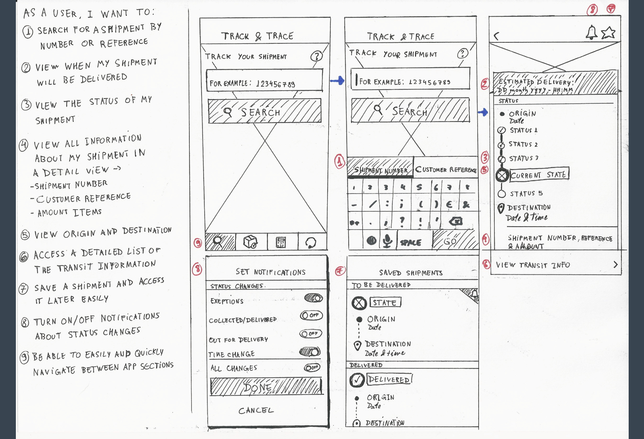
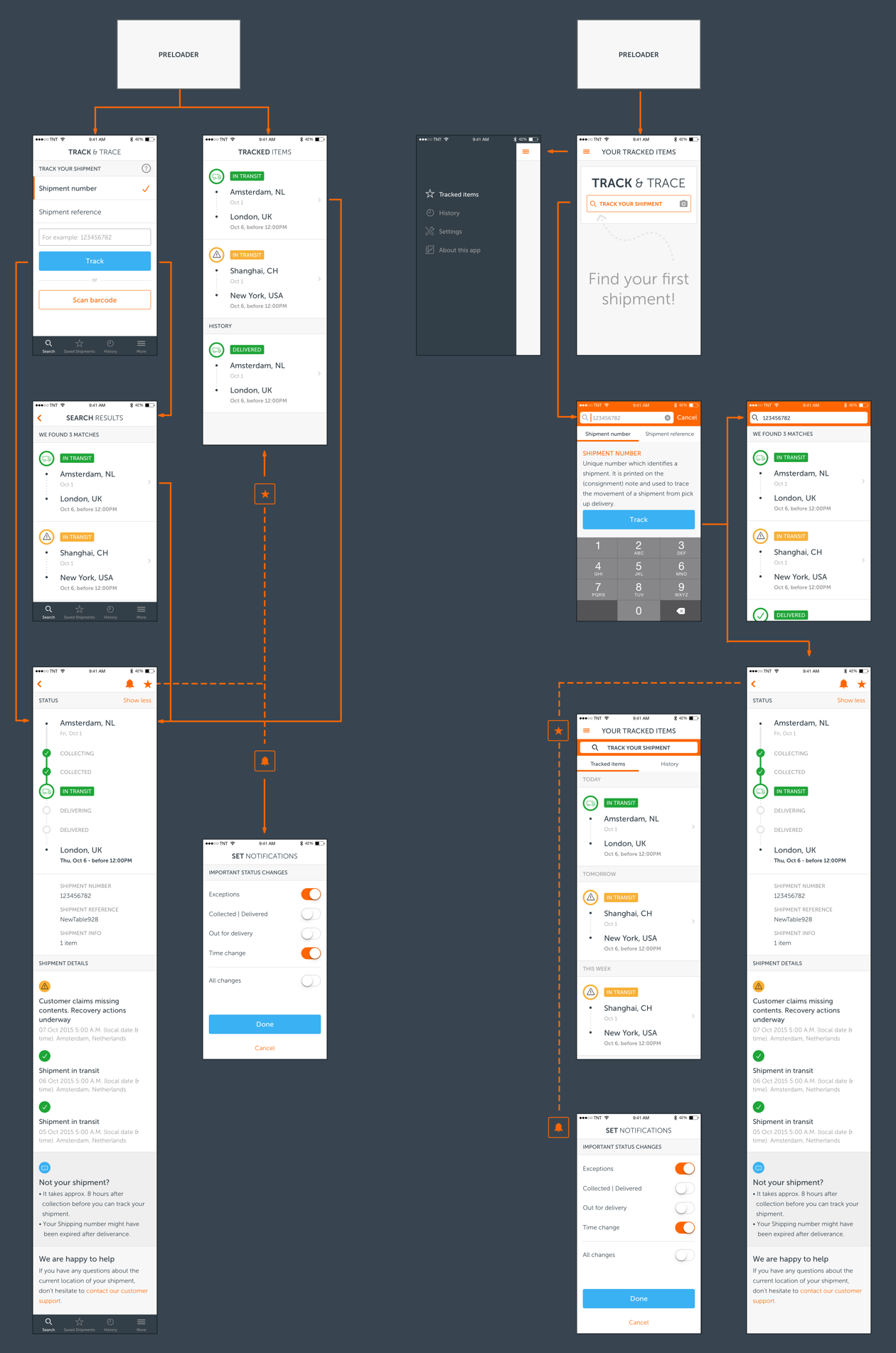
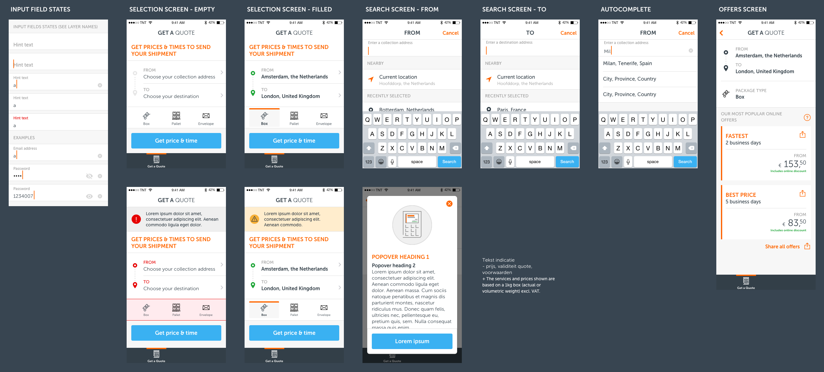
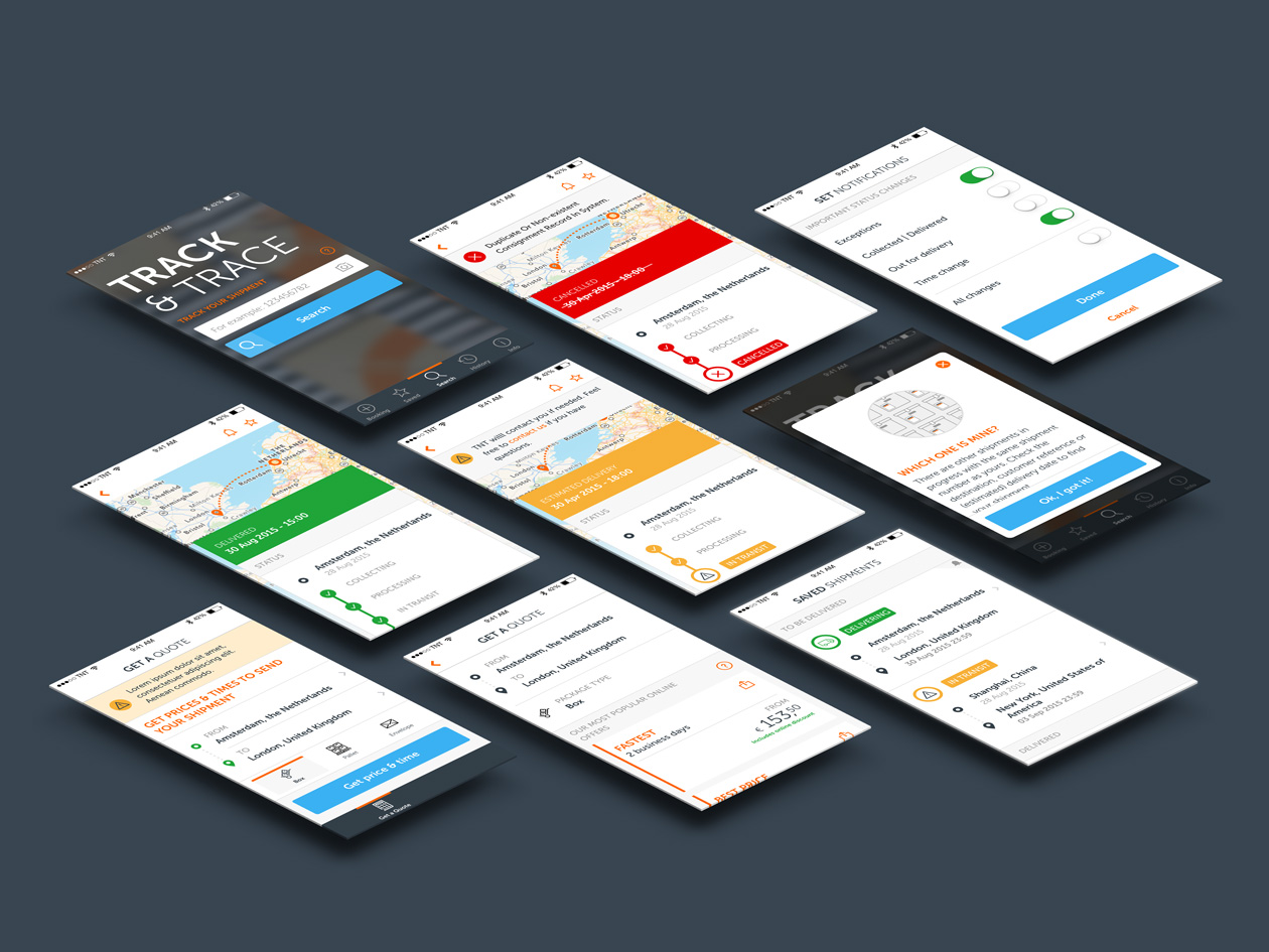
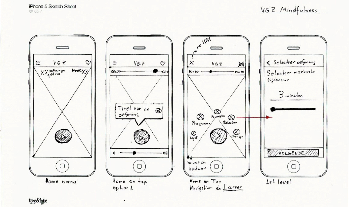
Design concept
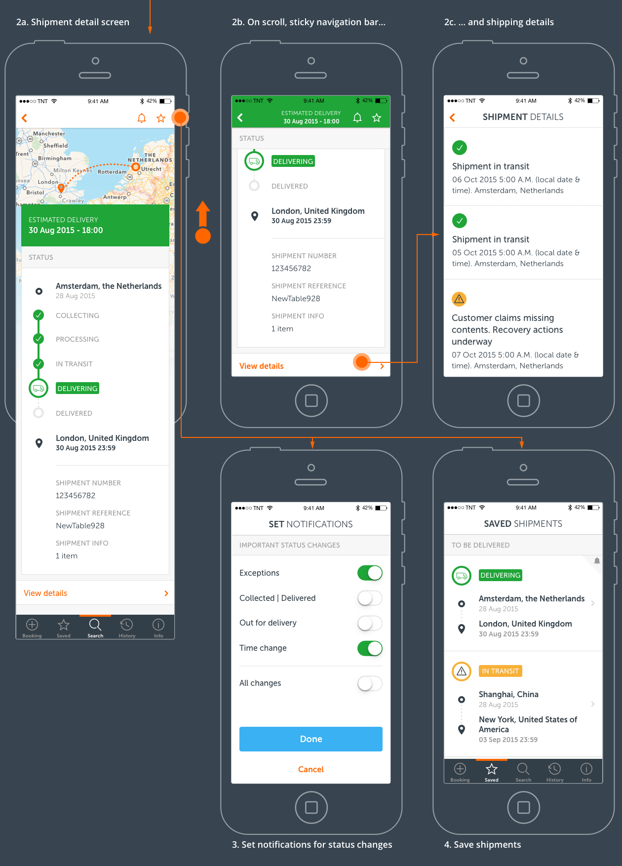
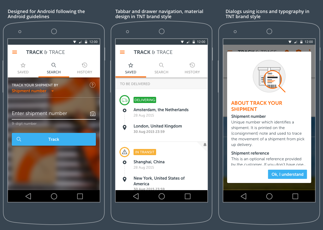
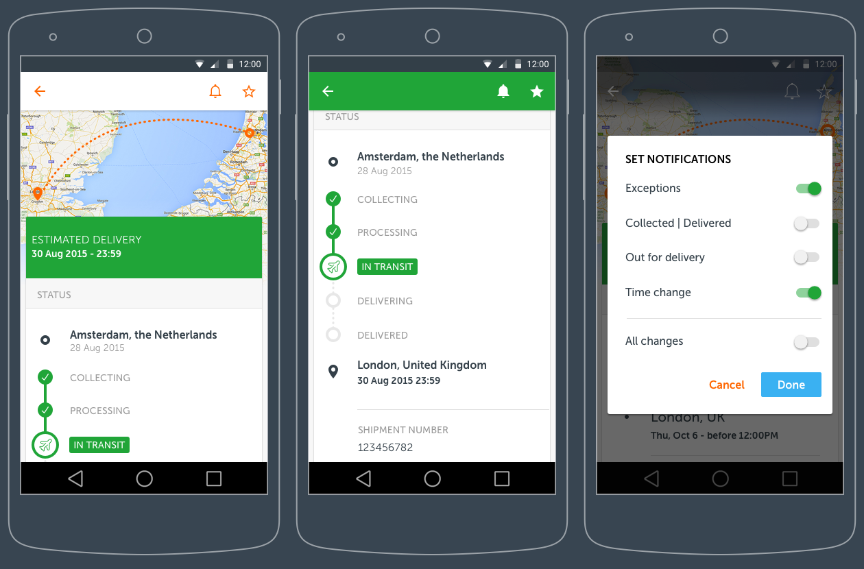
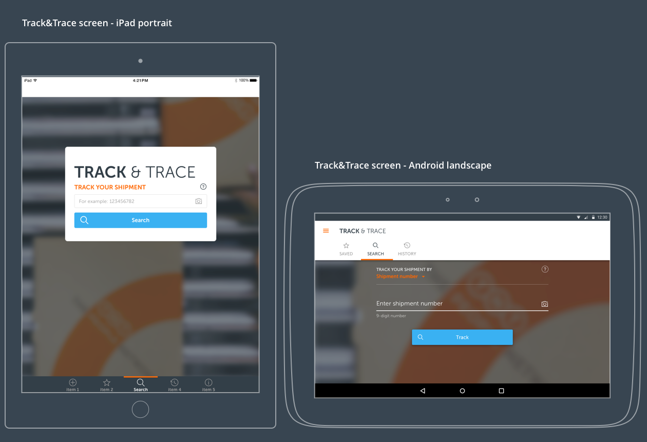
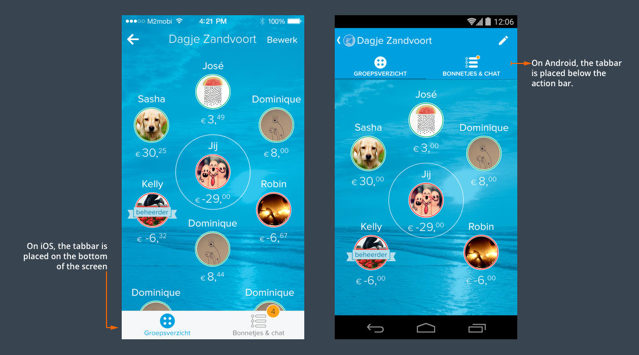
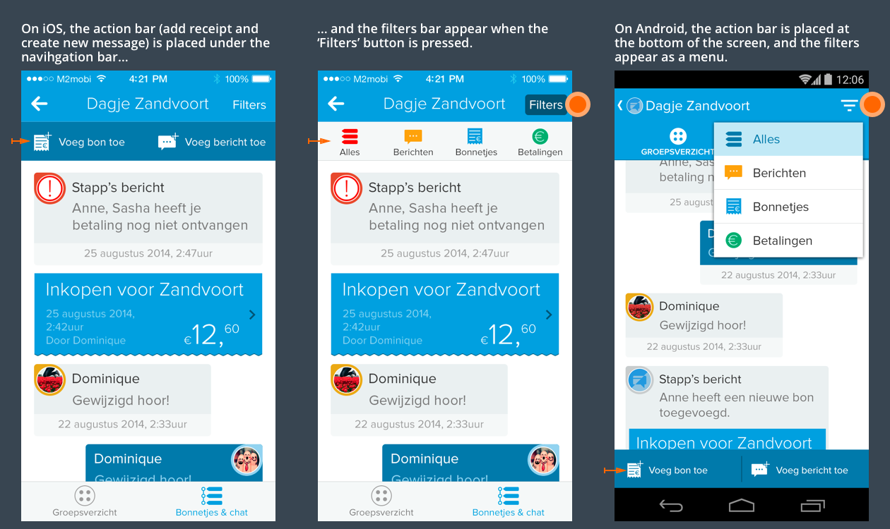
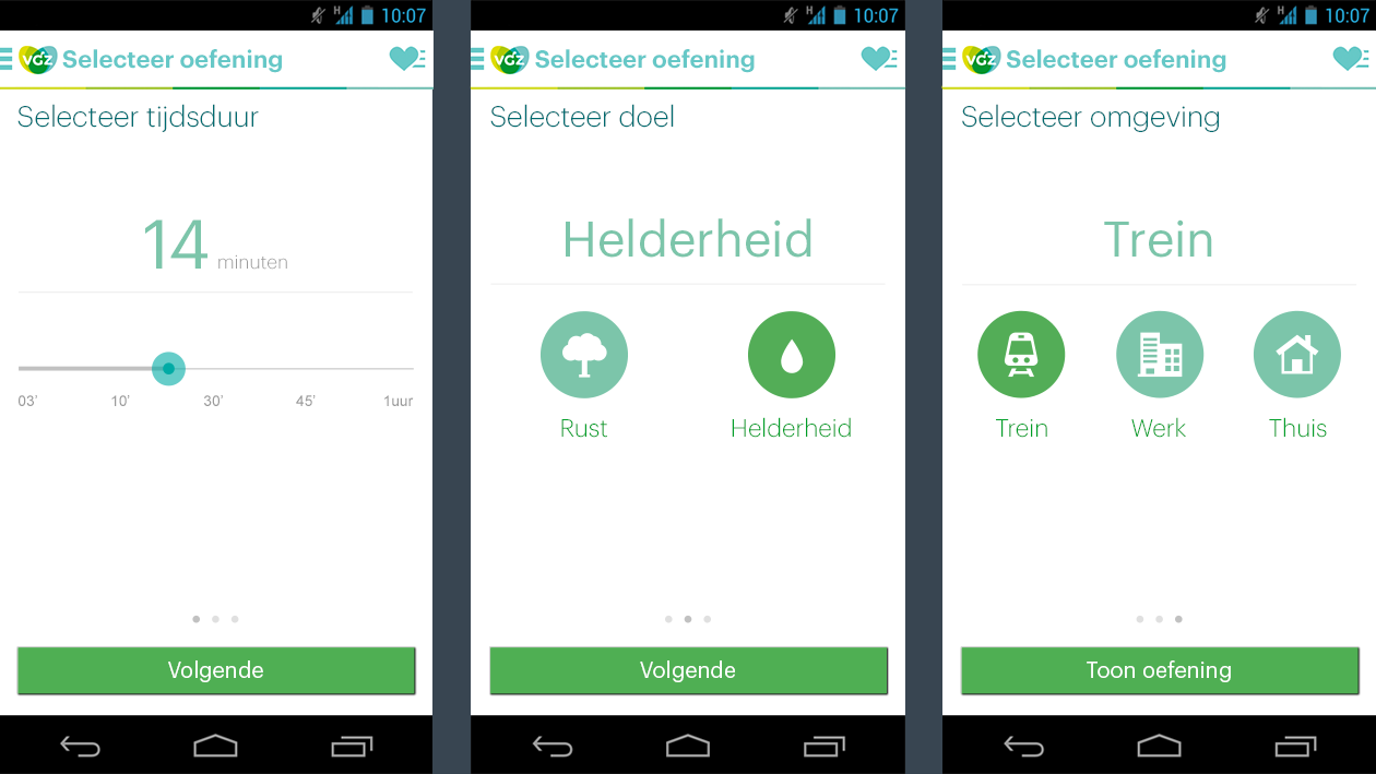
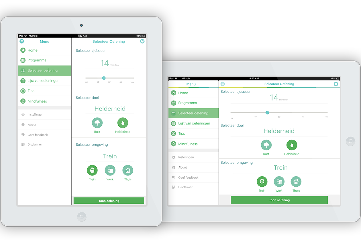
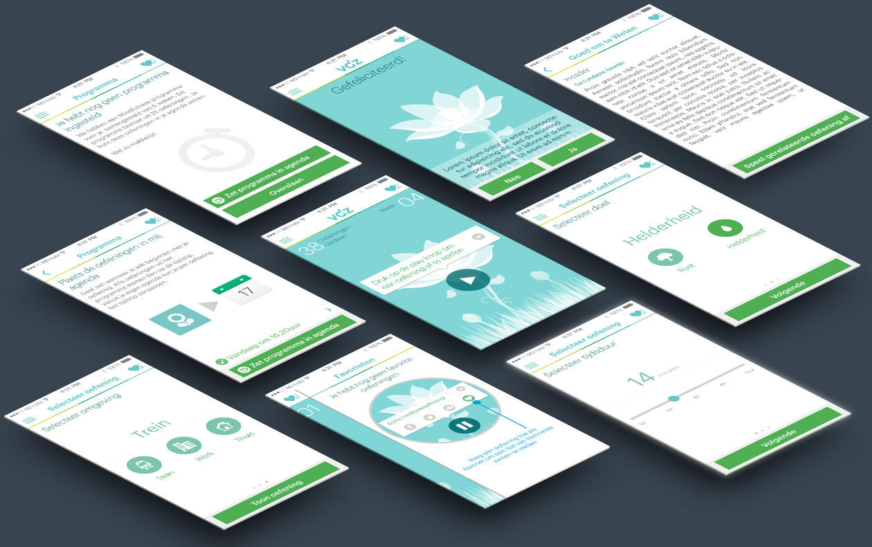
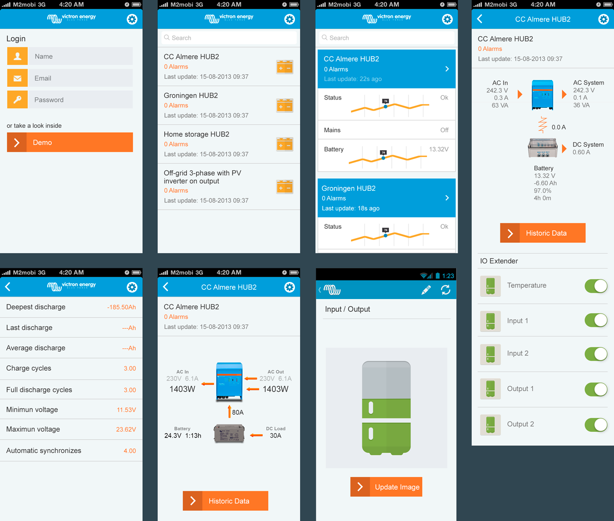
The screens below show a concept flow for the recipient experience. Based on the existing functionalities, these designs show how the app would look like after applying the recent brand guidelines and improving the main navigation by using a tabbar (iOS) and side navigation (Android).

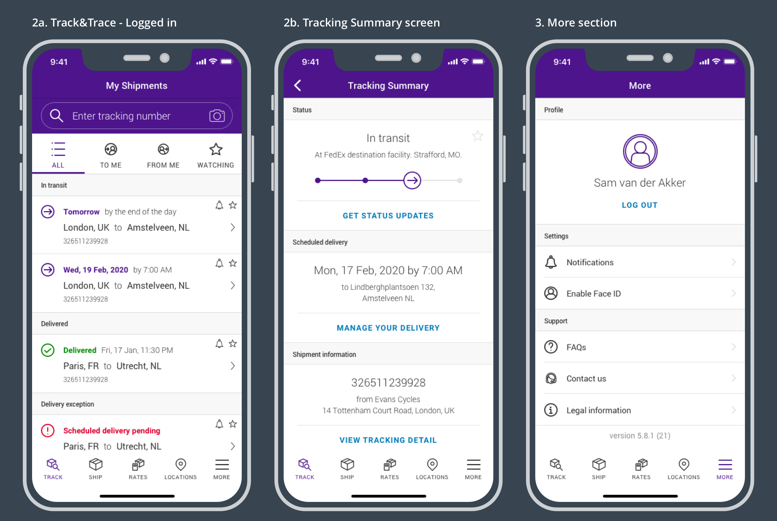
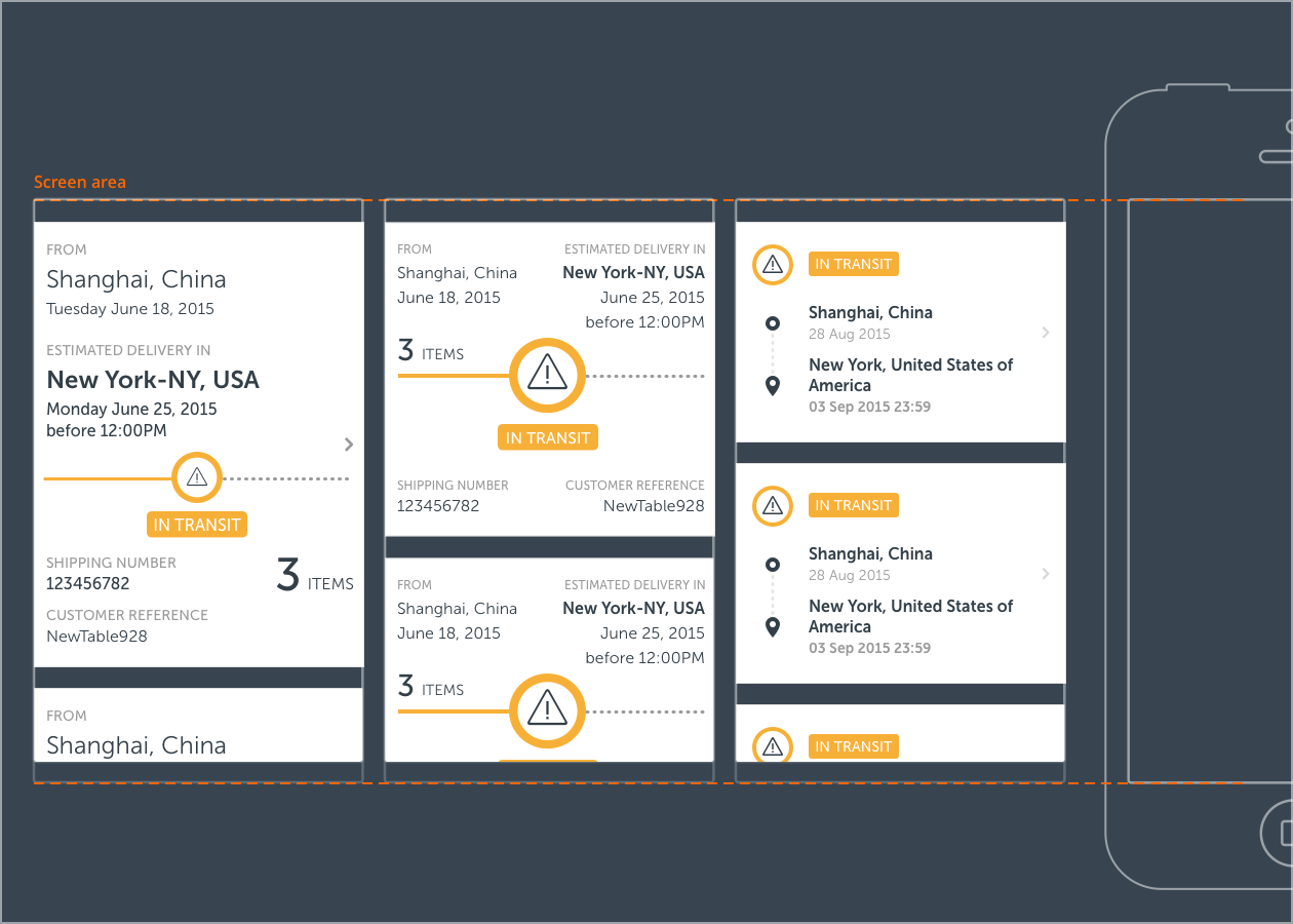
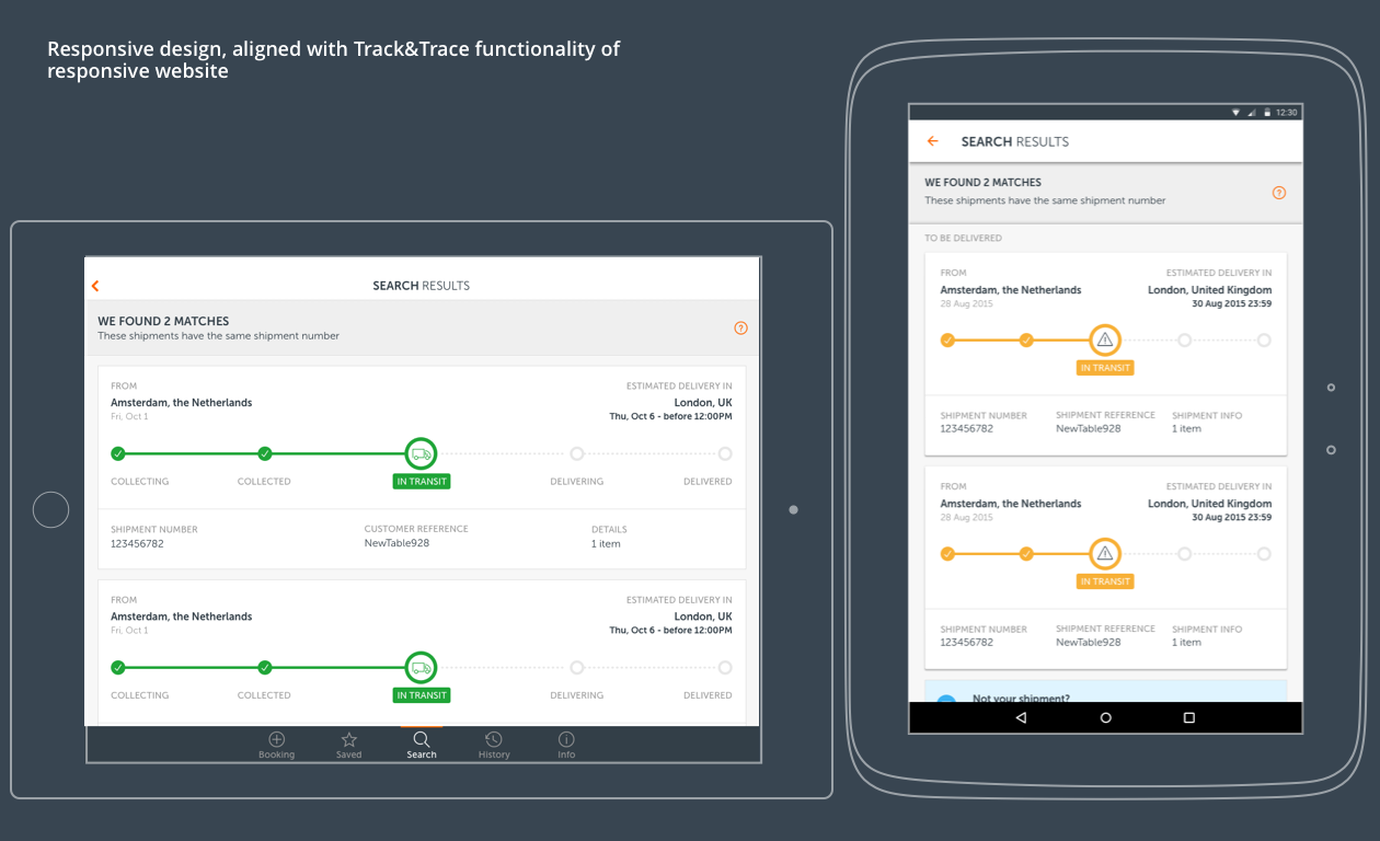
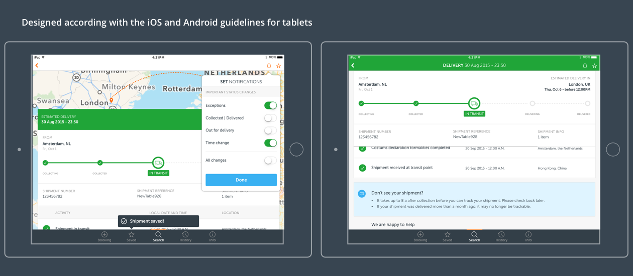
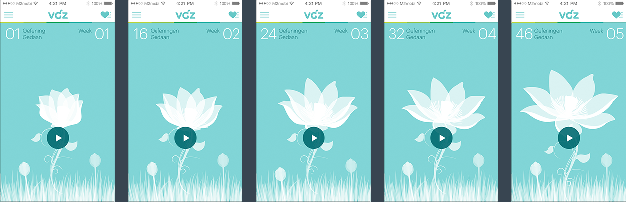
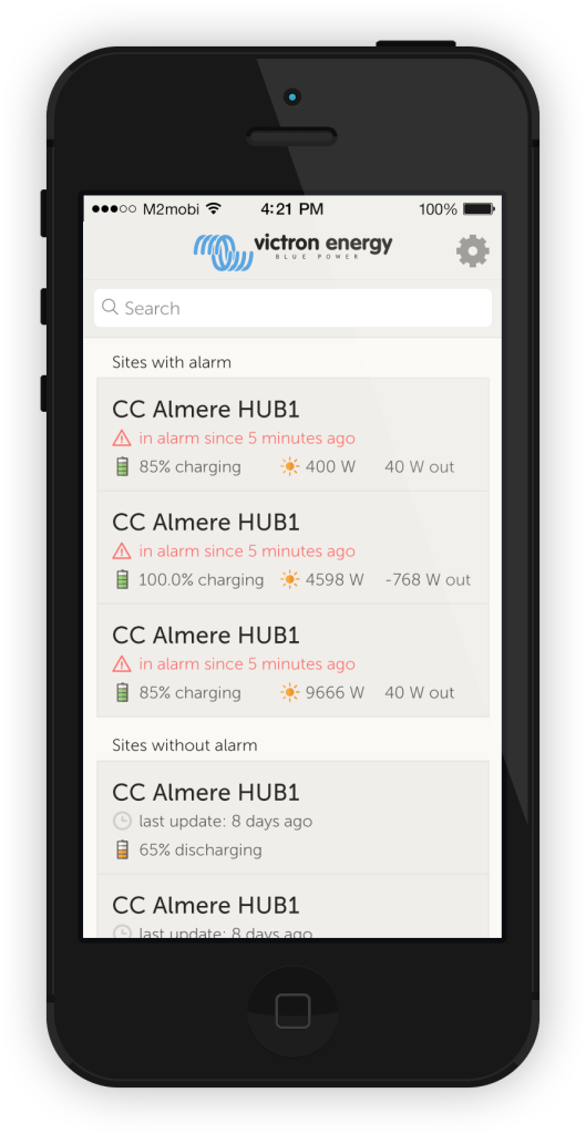
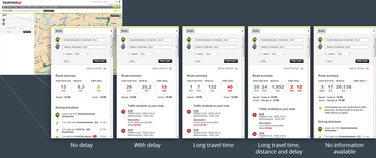
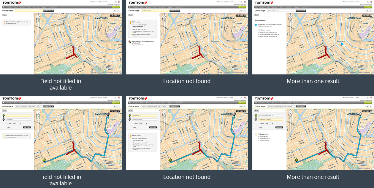
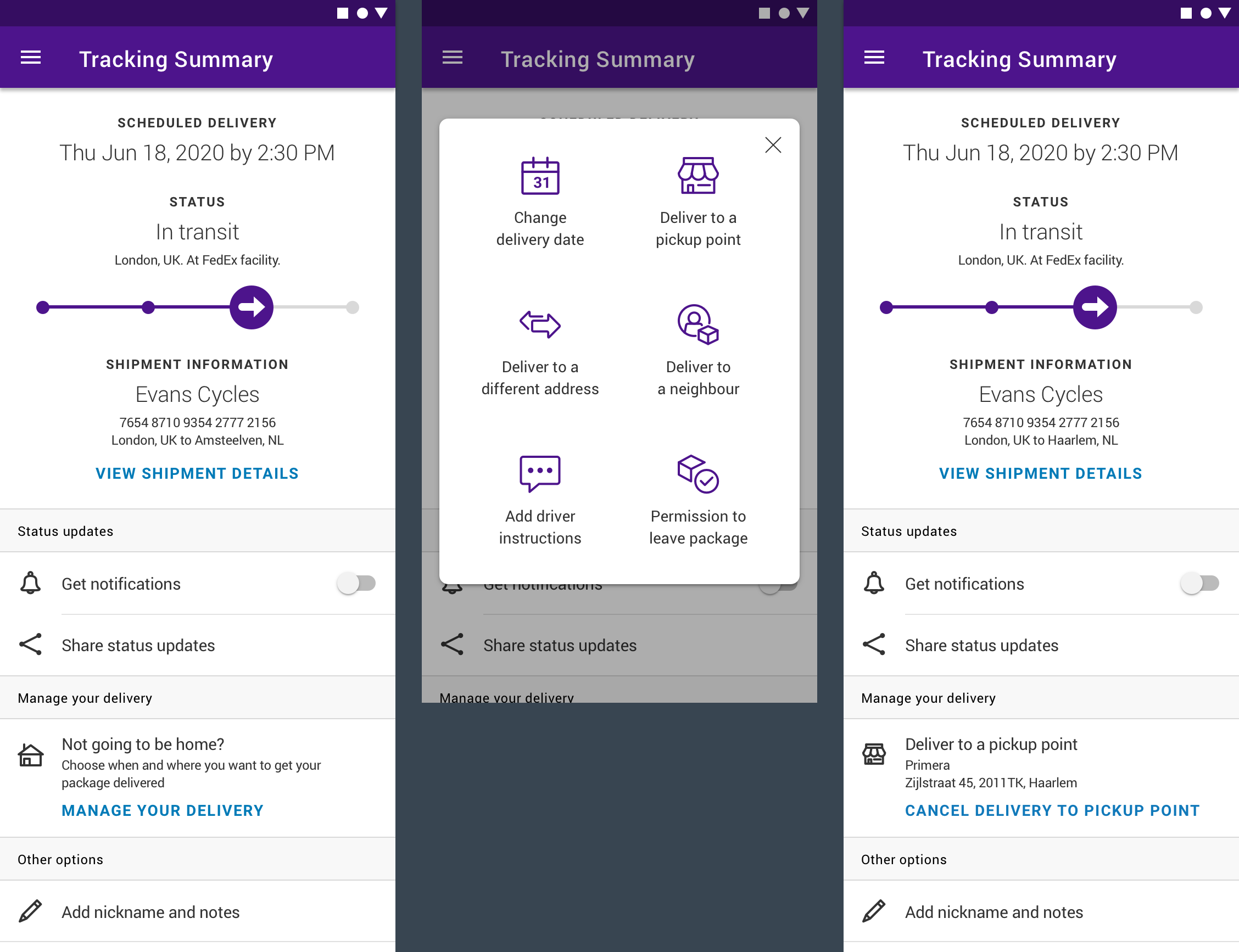
The Tracking Summary Screen
The Tracking Summary Screen is one of the most used areas of the app. The screens below show different iterations and options created with input from a varied set of stakeholders, brand guidelines and a complex set of business rules. These designs were validated in several usability tests and adjusted based on user feedback, resulting in a final design that ensures an optimal user experience while, at the same time, covering all business requirements and backend limitations.

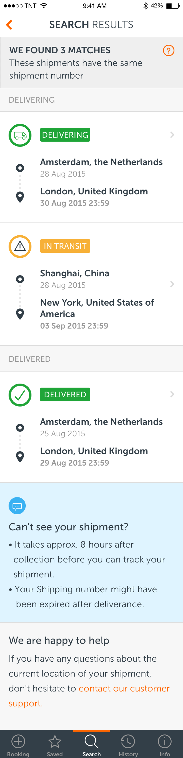
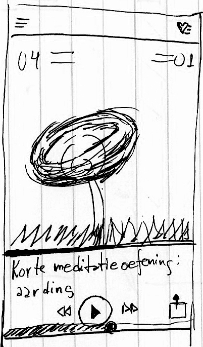
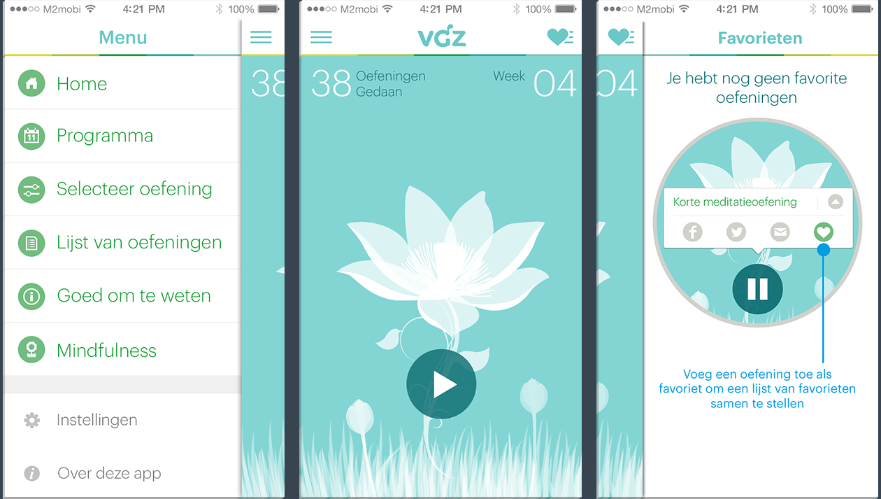
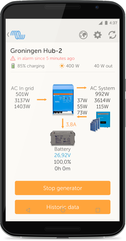
FedEx Delivery Manager®
The FedEx Delivery Manager® is a functionality on the Tracking Summary Screen with which users can manage their delivery. For example, users can choose another day or location to get their shipments delivered should they not be at home at the scheduled day and time.
This functionality was quite complex given differences in logistics processes in the US and across the world, as well as many backend and legacy system limitations.
In the US, users can configure delivery options independently from each other. For example, a user can simultaneously request a vacation hold and add a delivery instruction. For this reason, the interaction design allows all options to be visible at the tracking summary screen at the same time.
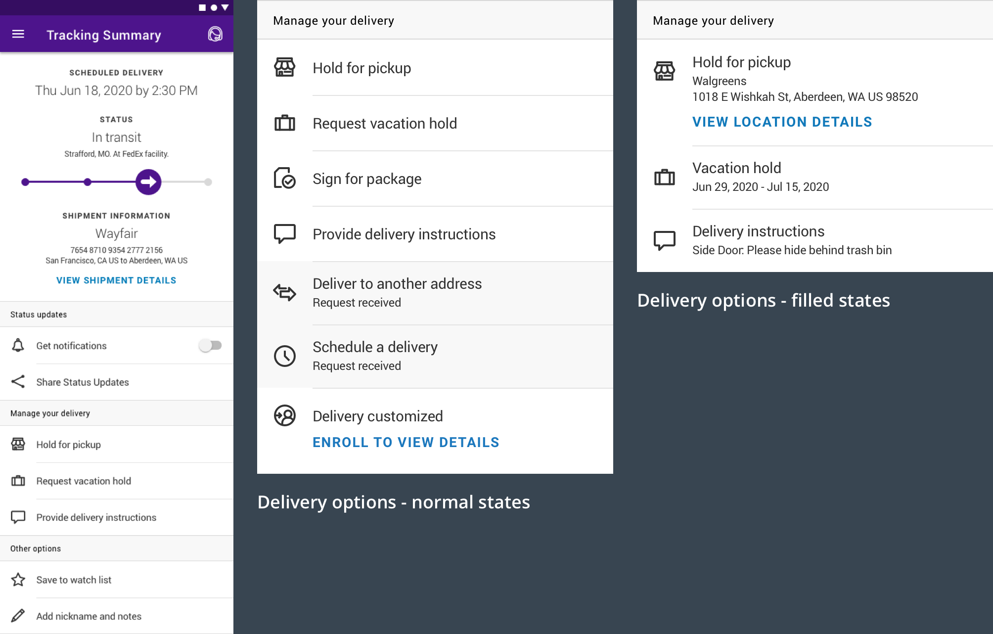
For international markets, users can only choose one delivery option at time. To avoid options disappearing from the action list, the options are placed in a modal that overlays the tracking summary screen.
In this way, the interaction design is created for each specific market, ensuring the best contextual user experience, while still keeping the same FedEx look and feel and brand guidelines throughout the app.
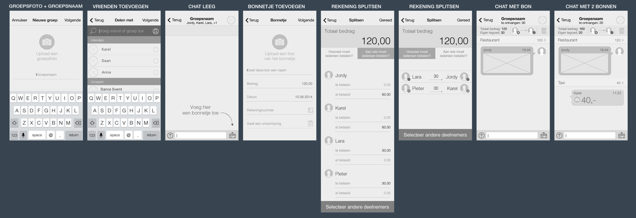
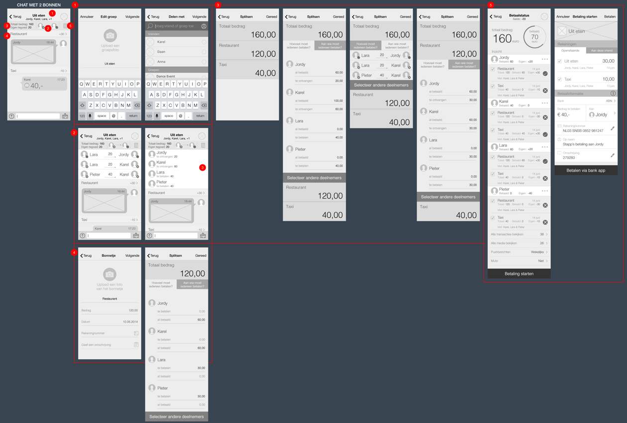
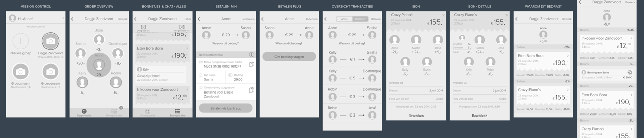
Project 2 – City Logistics
Overview
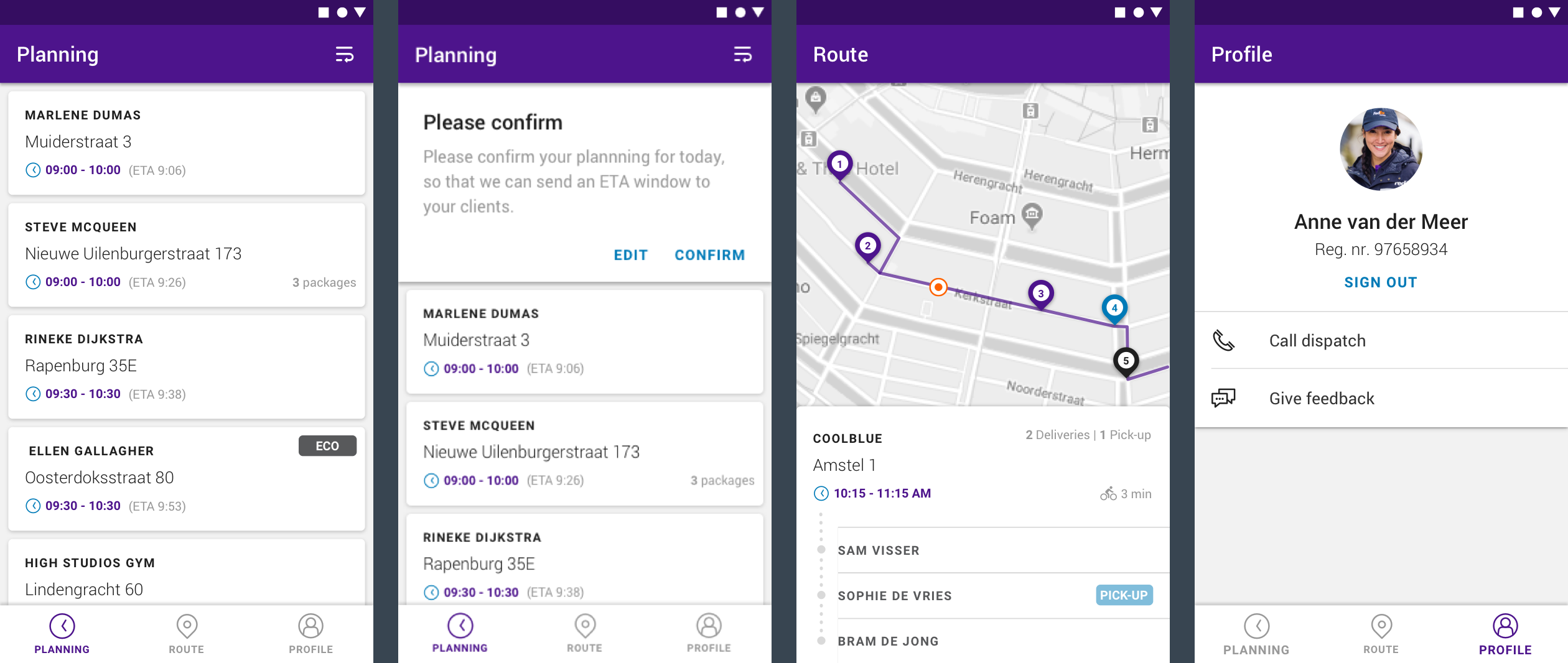
This project was a proof of concept for a bike courier application aiming to explore the opportunities and capabilities of having such an application being used by FedEx bike couriers in the main European capitals. This proof of concept was designed for Amsterdam, but was intended to be expanded to Berlin and other capitals in Europe.
At the beginning of the day, the courier would scan the packages in the depo, which would generate an optimal route. The courier has the option to edit the order, and by confirming it, the app would display an estimated time of delivery for each address. Clients would be notified about these times, and any changes that would happen along the way, reducing the time window they would have to be home waiting for the courier.
My Role
I was responsible for the user experience and interface design of the Android app. Together with the team in Amsterdam, we had to understand the whole logistics related to package delivery in big capitals, and think of a way of making it possible to do it in a small vehicle such as a bike.
Duration
This project took place between August and October 2019.
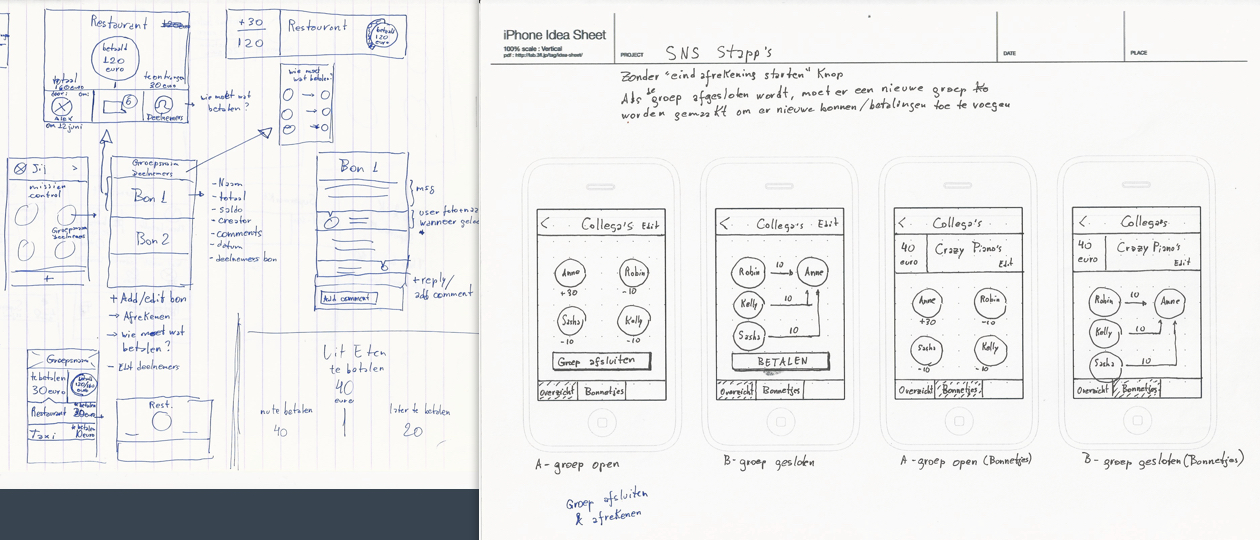
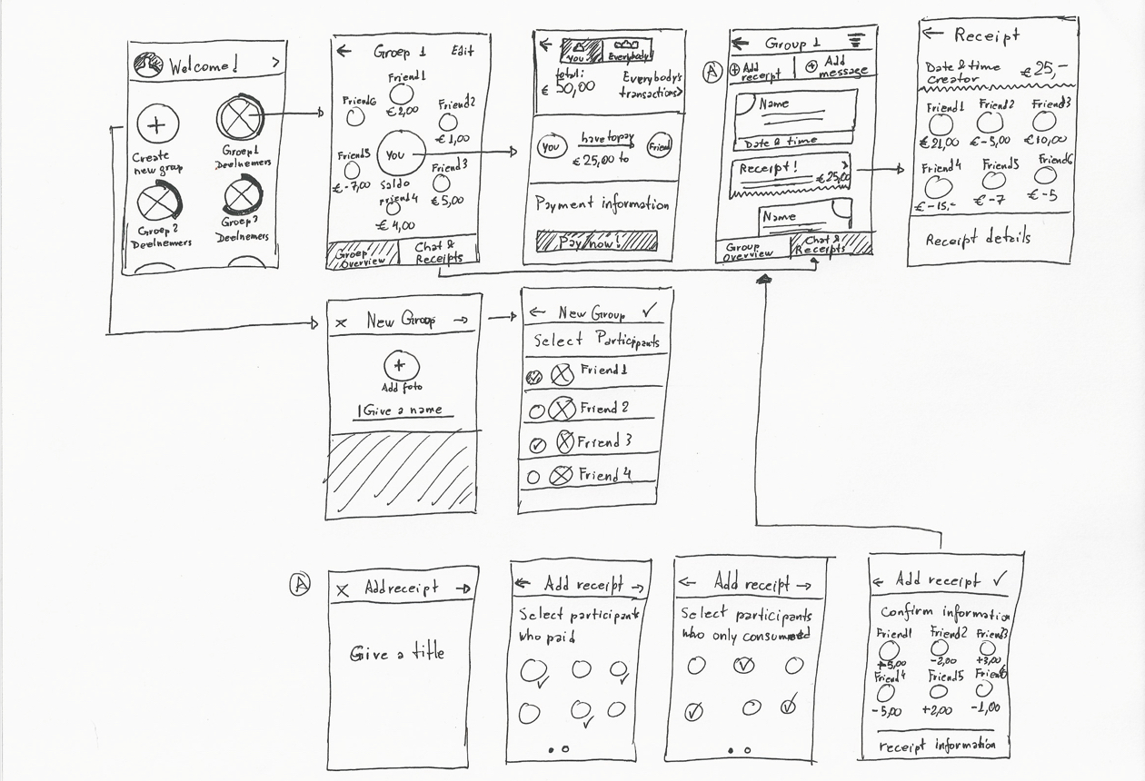
Project 3 – File a Claim
Overview
The goal of this proof of concept was to get the teams in Amsterdam and Dallas to get to know each other better and collaborate on a project for the first time, getting familiar with coding, designing and worming in a team from different sides of the world.
The result was a connected experience for filling in the File a Claim form on FedEx.com easily by using the mobile phone as a second screen.
My Role
Together with the developers, we created the concept for the project. I was responsible for the user experience and interface design of the mobile app and the mockups for the web pages.
Duration
From concept creation to final development and demo to stakeholders, this whole project was done in only one week, in September 2018.
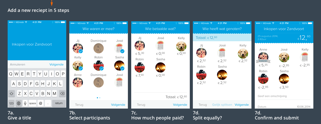
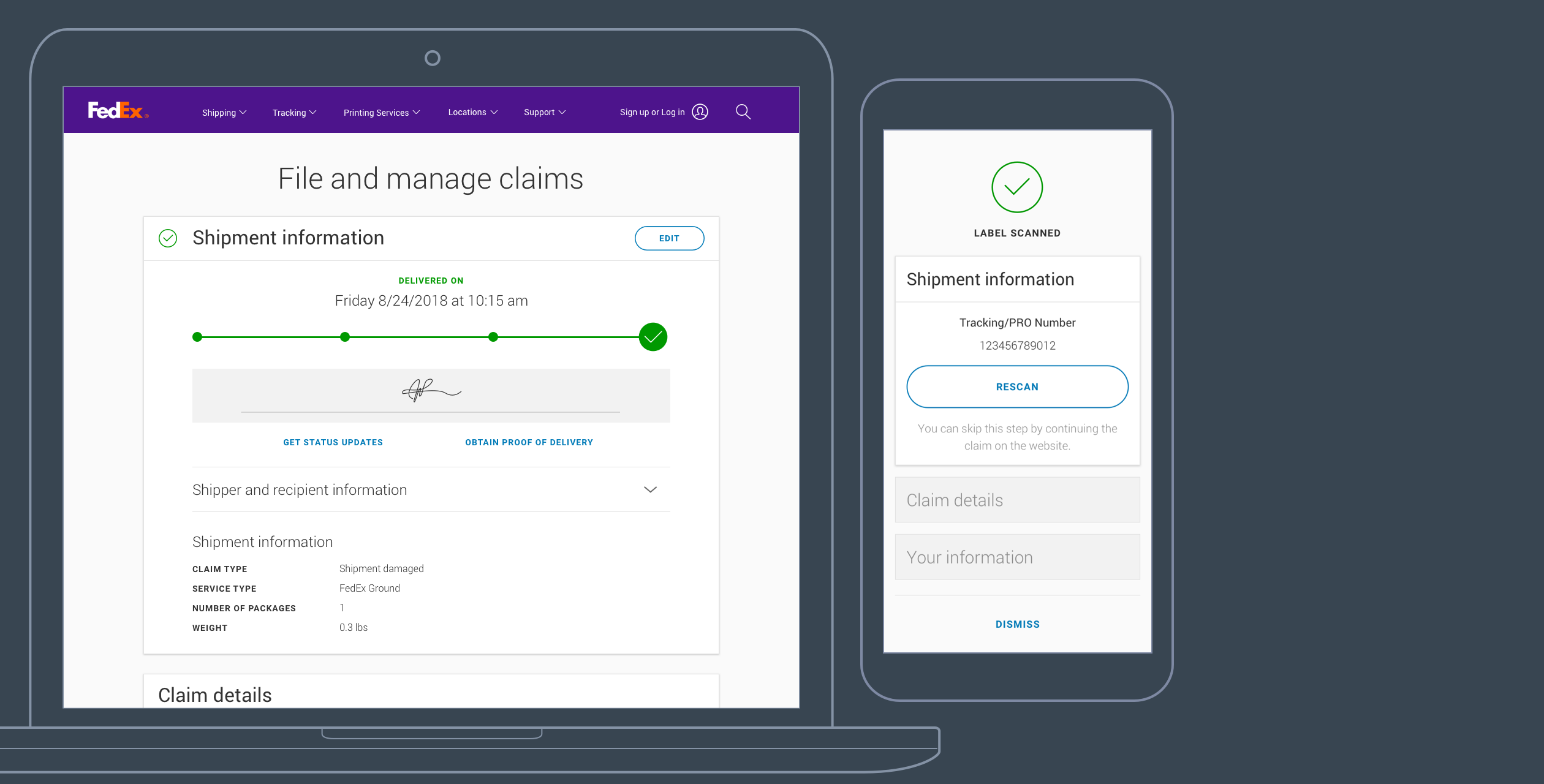
STEP 1
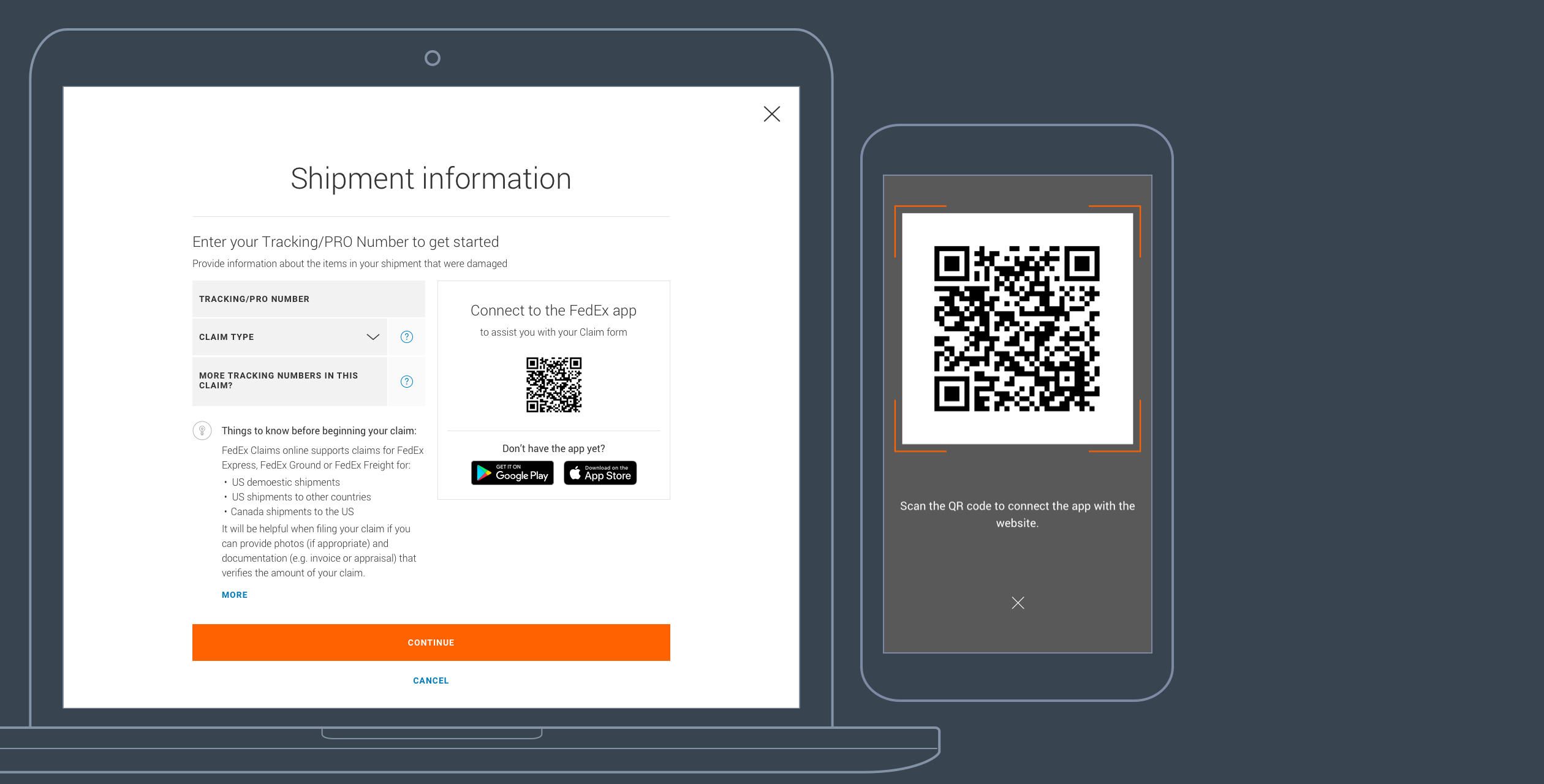
The user opens the File a Claim form on the web, which has 3 steps – Shipment information, Claim details and Your information.

STEP 2
In the Shipment information section, the user has to enter the Tracking number to get started, which can be done manually, or by scanning the QR code with the mobile app. Scanning the QR code will connect the app with the website.

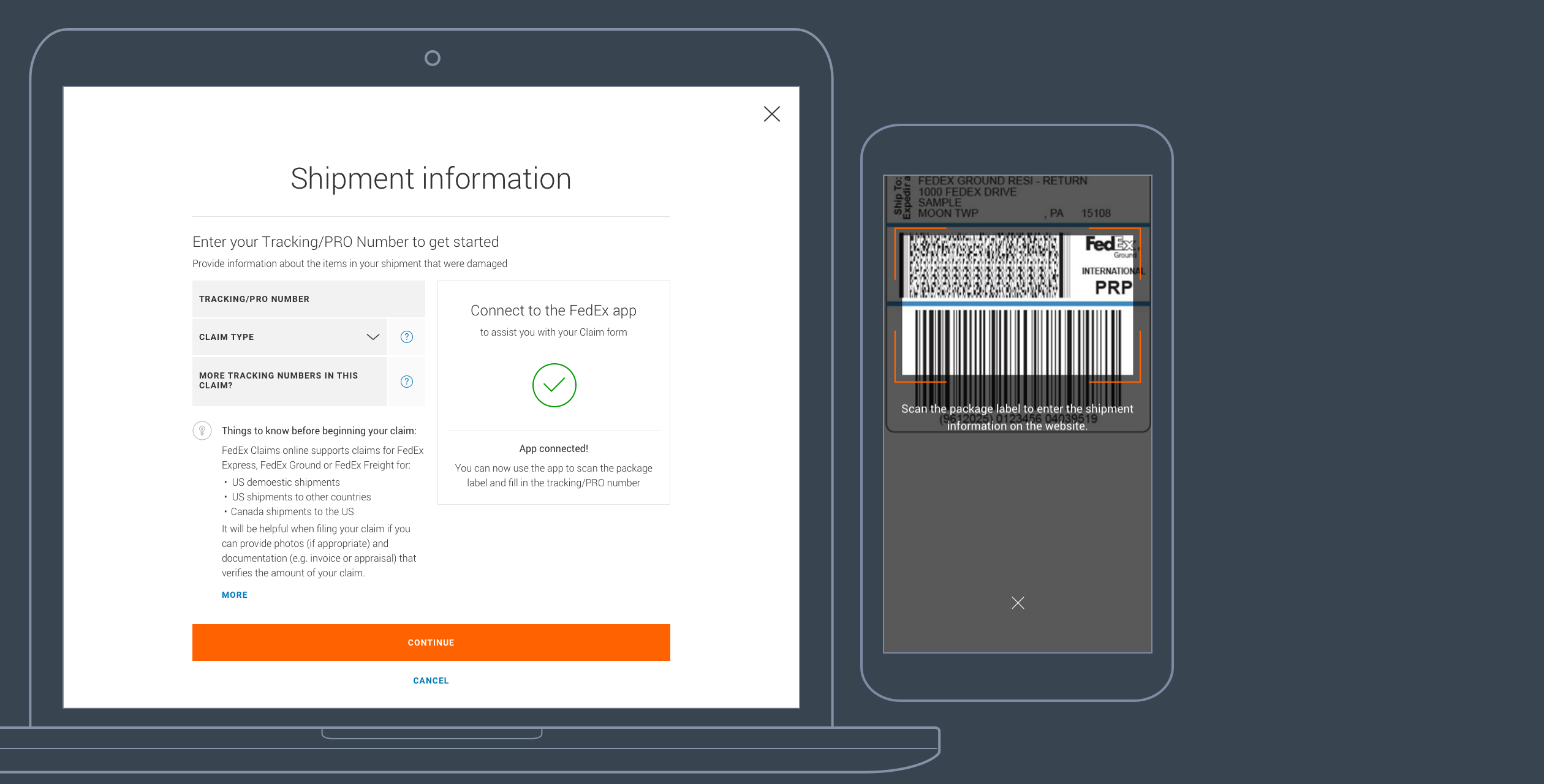
STEP 3
Now the app is connected, the user is asked to scan the package label on the damaged package, which will automatically fill in all shipment information on the website.
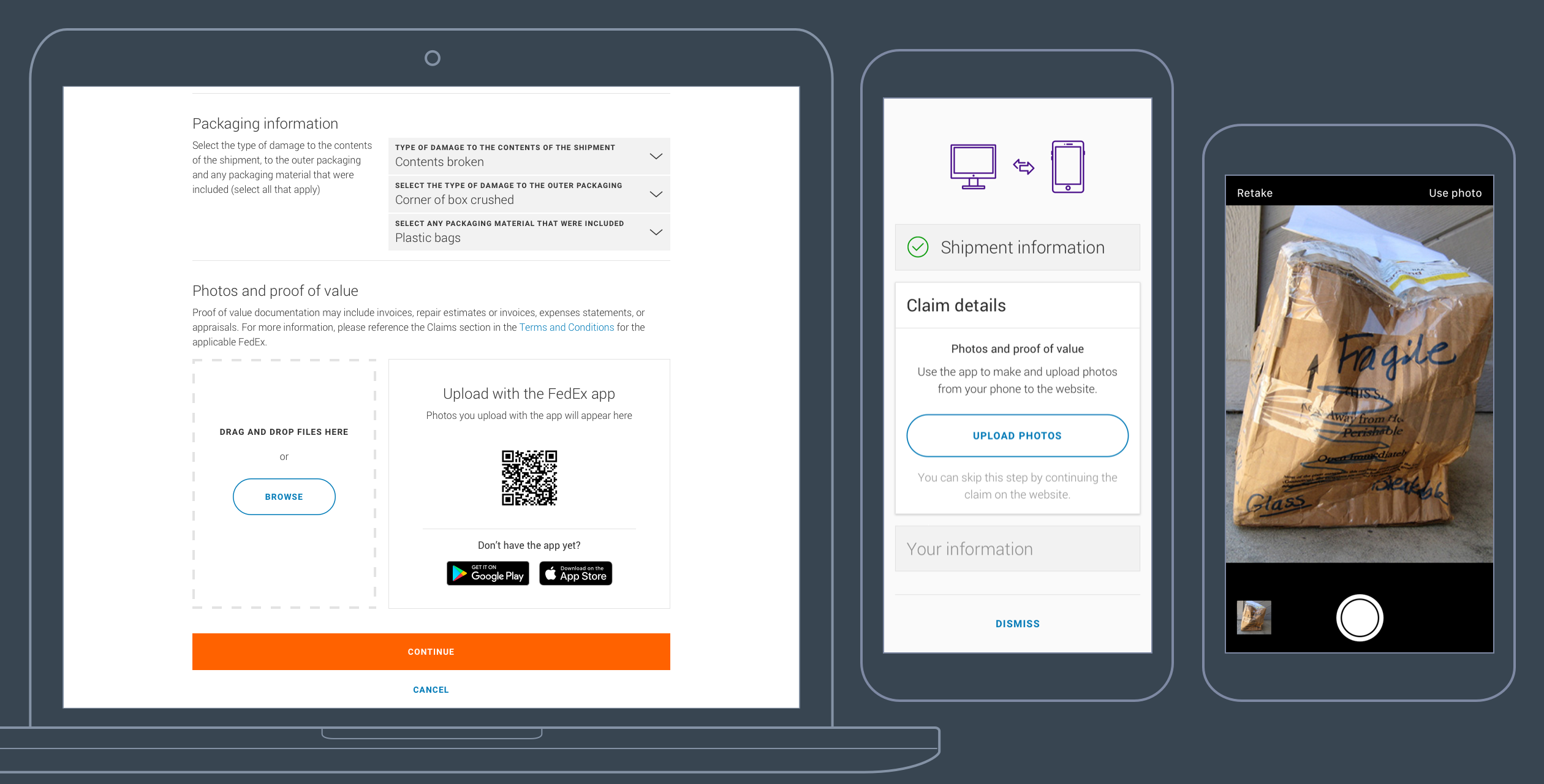
STEP 4
On the Claim details section, the user can upload photos of the damaged package. Since the app is connected to the website, the user can take photos with the phone, and they will be uploaded to the website in real time.

STEP 5
The last section containing personal information will be automatically filled in with the information used when the label was created, and doesn’t take any further action from the user. With only one click, the user can submit the claim with no effort.